Up next — 2020–2025
Designing for Scale:Making Sesimi DAM the Go-To Platform for Global Brands
UX DesignUser ResearchFront-end EngineeringProduct
Client
Affectable
Role & Contributions
UX Design, User Research, Front-end Engineering
Timeline
August 2025 – present
Tools
Figma, Maze, SwiftUI, Lottie
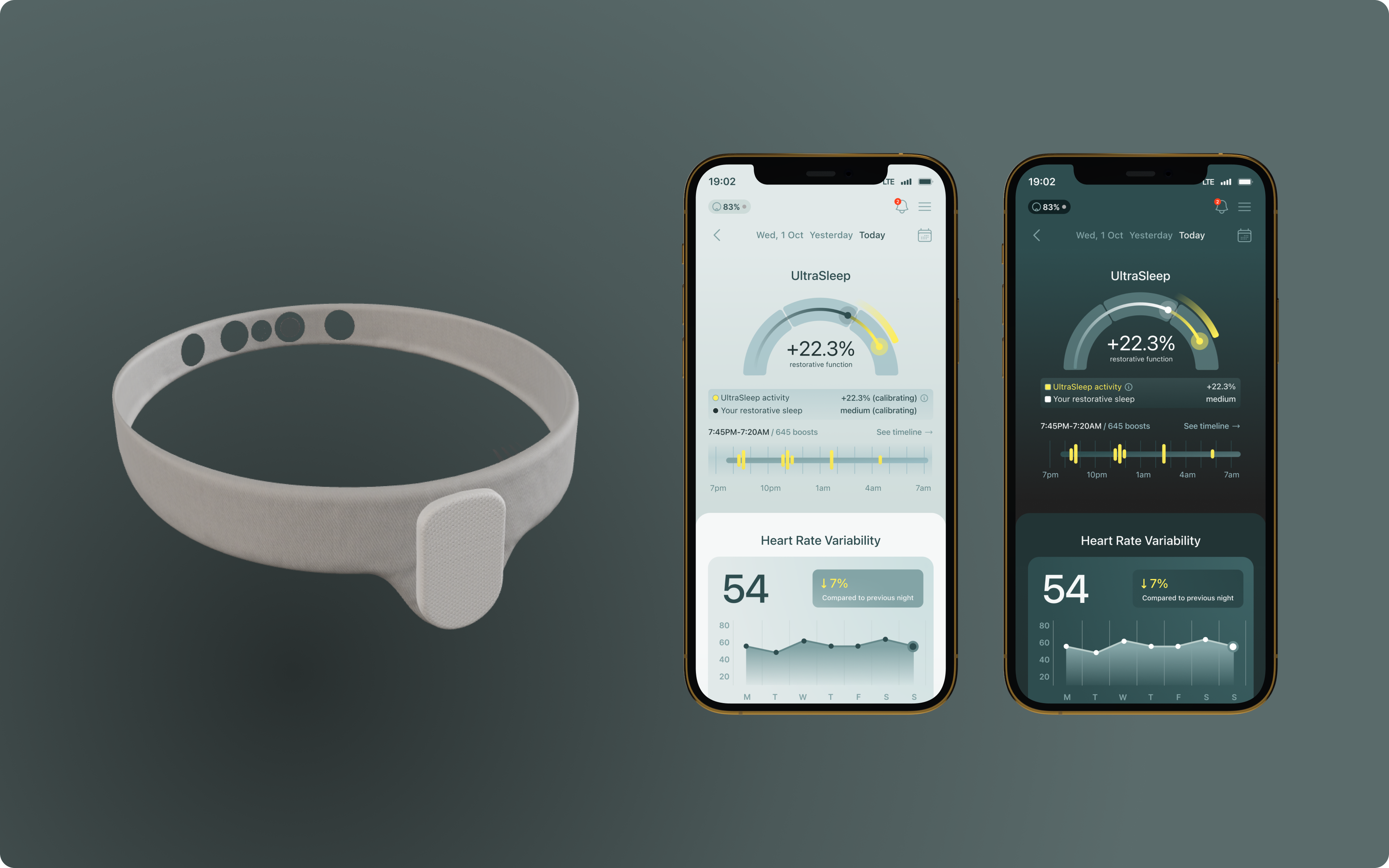
Affectable Sleep is a neurotech headband that reads EEG and uses audio stimulation to actively boost the amplitude of slow-wave sleep — increasing the restorative quality of deep sleep rather than just recording it. I joined as the sole experience designer in August 2025 to design the iOS companion app from the ground up, ahead of the first beta launch in spring 2026.
Existing sleep apps train users to fixate on scores and hours — metrics that create anxiety without offering a path to improvement. For Affectable, those conventions were a liability: a "bad" score on a night the headband was actively helping would undermine trust in the device. The core design challenge was inventing a new visual language for sleep that focused on restoration and improvement, not judgement.
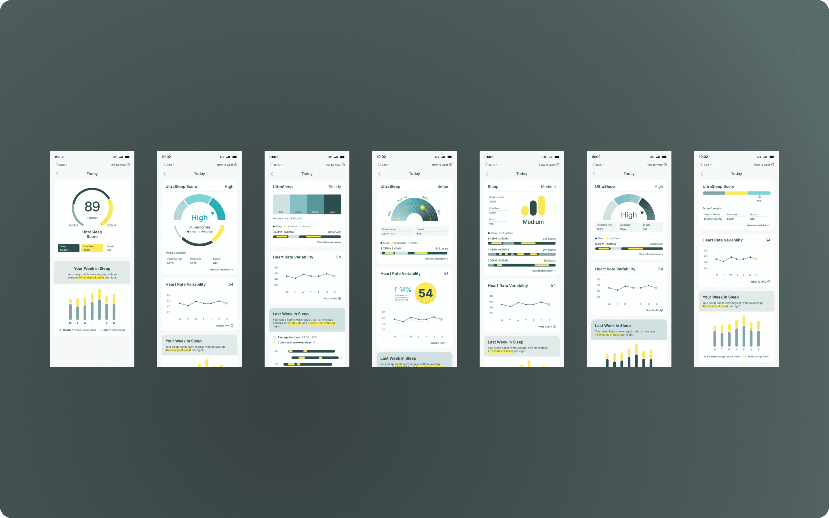
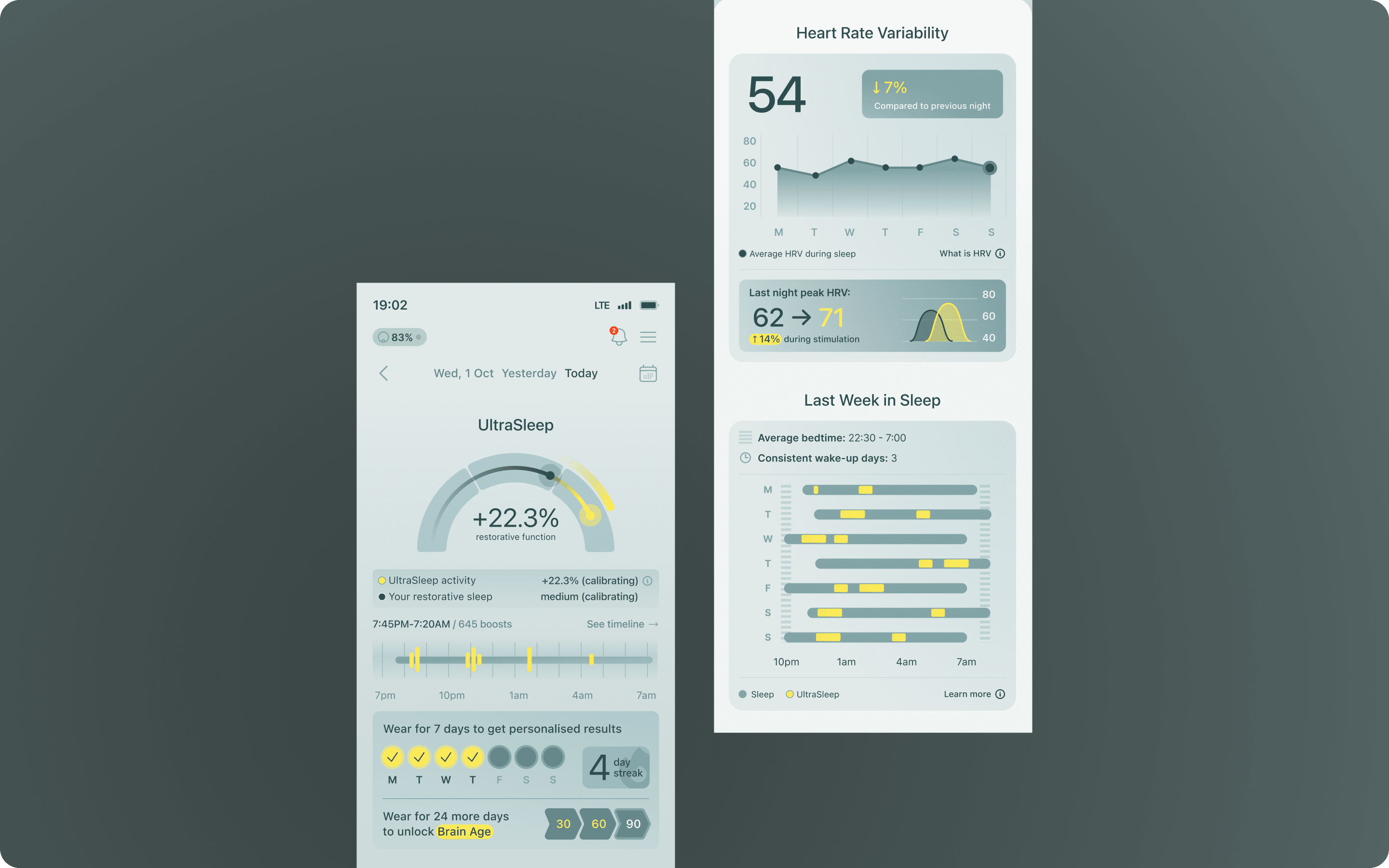
Two rounds of user research — with young parents via Maze and biohackers from the waitlist — directly shaped the interface. Key design decisions included a gauge-based visualization separating baseline restoration from UltraSleep boost, non-judgmental verbal labels (Baseline / Medium / High), and a +xx% boost figure surfaced after users asked for a concrete number to hold onto.
App is ready for its first beta cohort of early headband testers in April/May 2026. Apple Health integration and data export are scoped for a subsequent release.
The Affectable Sleep headband reads EEG signals while you sleep and plays targeted audio stimulation through a built-in speaker to increase the amplitude of slow-wave sleep — the phase most responsible for physical recovery and cognitive restoration. Unlike passive trackers, it actively intervenes. The founder's vision shaped some of the design direction: sleep apps that surface bad scores and unfilled progress rings make people feel worse about sleep without giving them any actionable way to improve it. The app needed to reflect what the device actually does for you, show users how their sleep has been boosted, rather than replicate the judgement-heavy conventions already in the market.
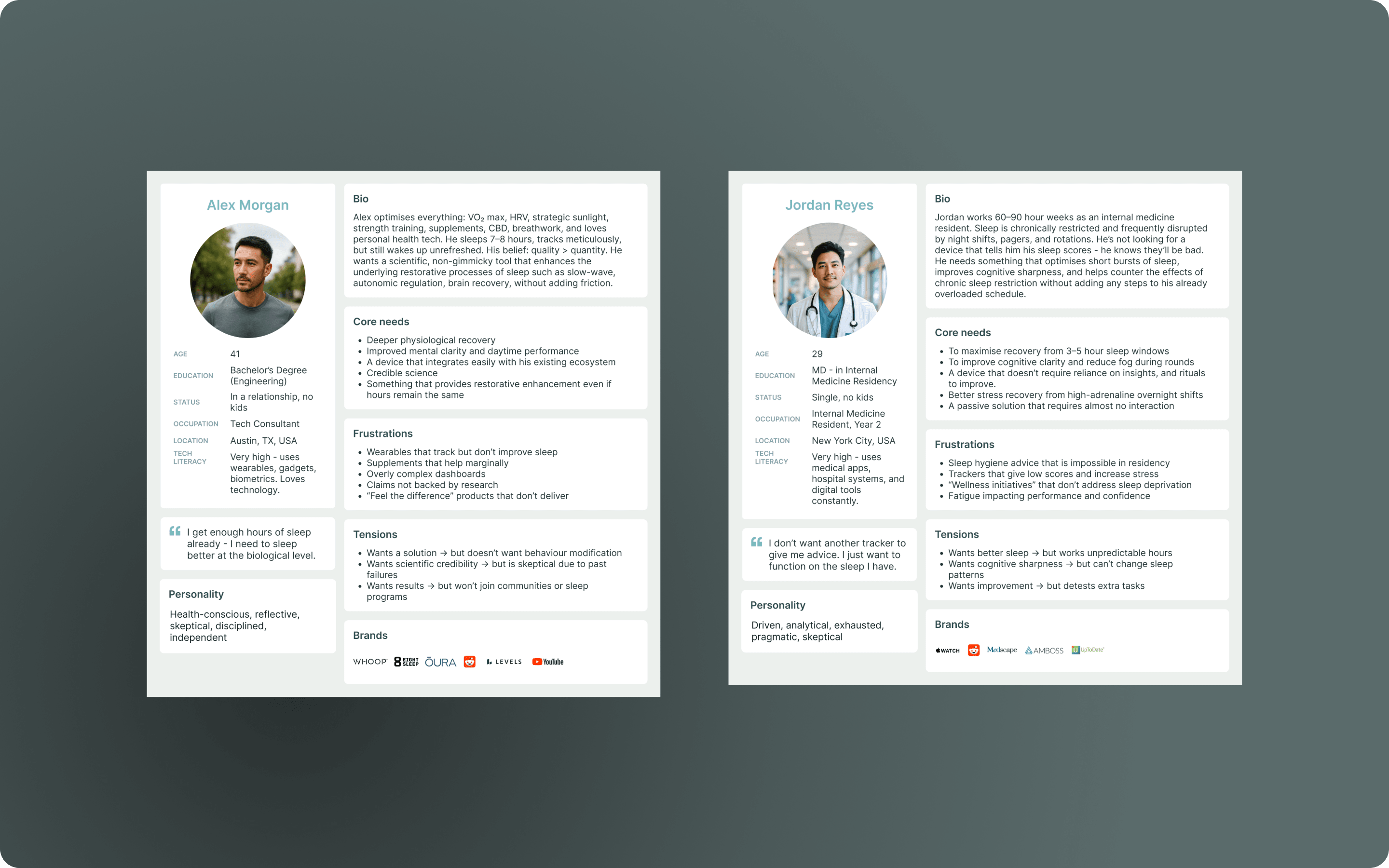
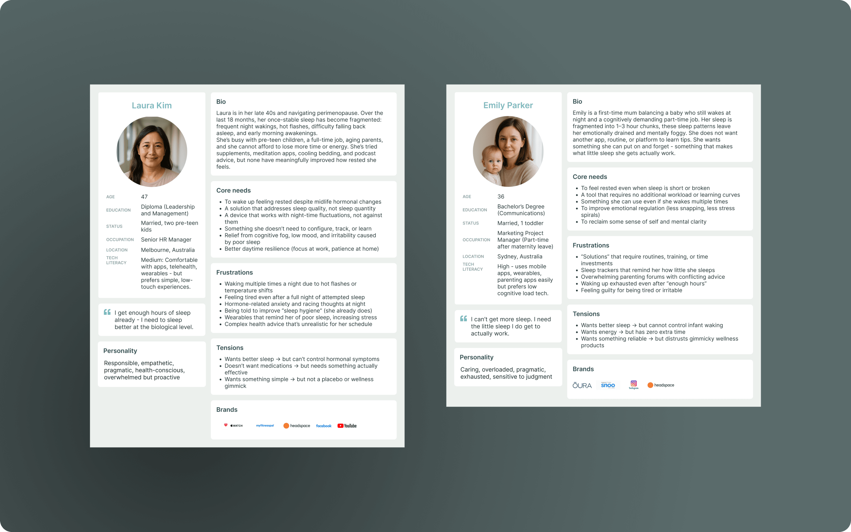
Three user groups shaped the product's direction, each with a distinct relationship with sleep and data. Biohackers were the most tech-literate segment — already wearing Oura rings or Whoop straps, comfortable with HRV and sleep stage terminology, and eager to go deep on the numbers. Premenopausal women and young parents represented the largest opportunity: chronically underslept, often measuring themselves against the eight-hour standard and falling short. For this group, hours-slept as a headline metric was actively harmful — research shows restorative quality matters more than duration, and this audience needed to feel that. Pre-med students were a tertiary group with overlapping concerns: disrupted sleep, high cognitive demands, and strong motivation to optimise performance.
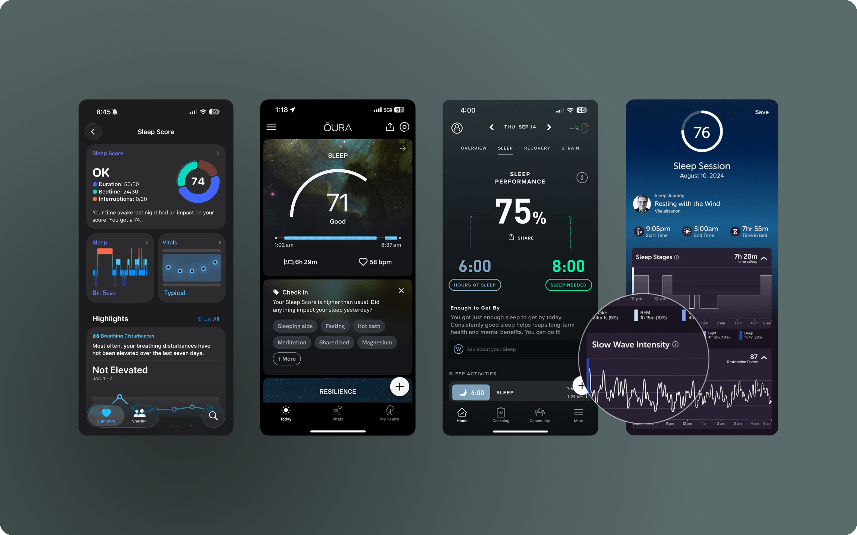
The dominant visual conventions in sleep apps — circular progress rings, numerical scores, colour-coded ratings — share the same flaw: they reduce a complex, personal, physiological process to a grade. A night where the headband actively improved deep sleep could still score "Low" if total hours were short. That's a trust-destroying experience for a hardware product whose entire value proposition is improvement. Circles that fill up were out. Numerical scores were out. Colour gradients tied to performance levels were out. The brief was to invent something that communicated restoration and boost without triggering the score-anxiety loop.
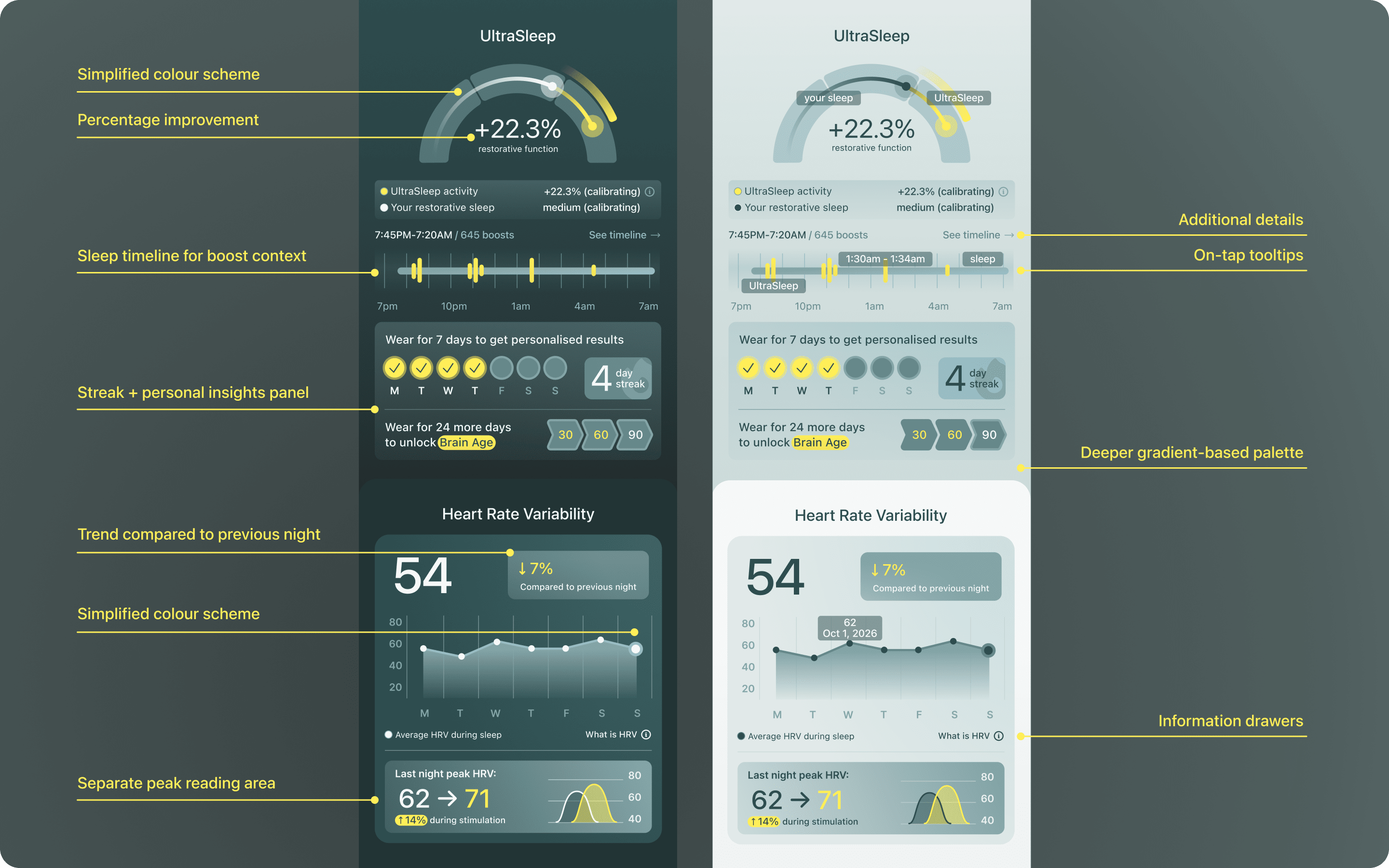
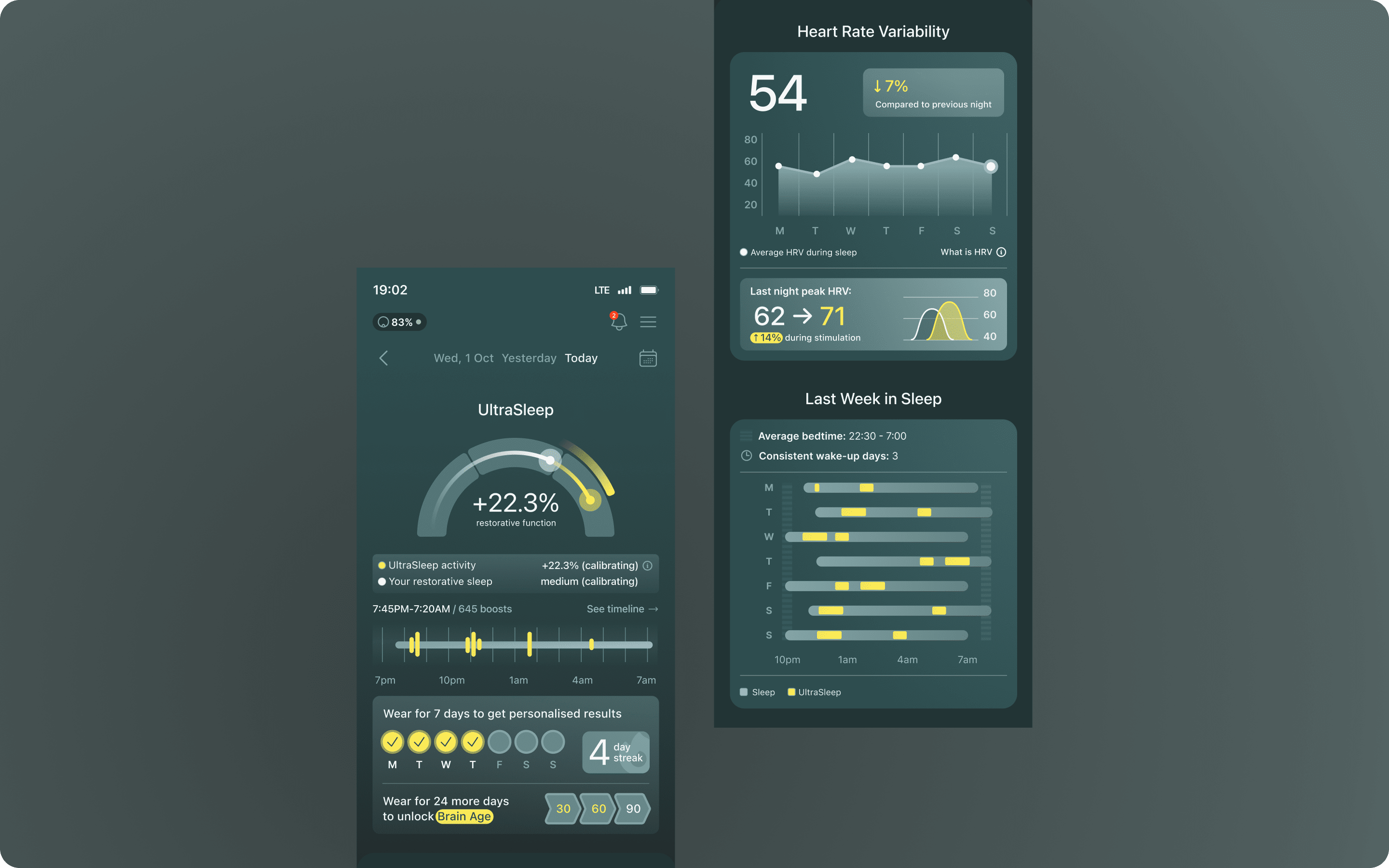
The central UI is a gauge-style visualization with two overlaid lines: your sleep restoration for the night, and a second line showing the UltraSleep boost — how much the headband's stimulation extended that restoration. The primary value shown is a +xx% boost figure — how much the headband improved your sleep relative to your personal baseline — which replaced the verbal label system after too many users found the vagueness of Baseline/Medium/High unsatisfying. The verbal labels remain in the legend, contextualising the "Your restorative sleep" portion of the gauge. A second research round flagged the gauge as too visually complex, so we simplified to a single colour treatment — keeping the form, reducing cognitive load.
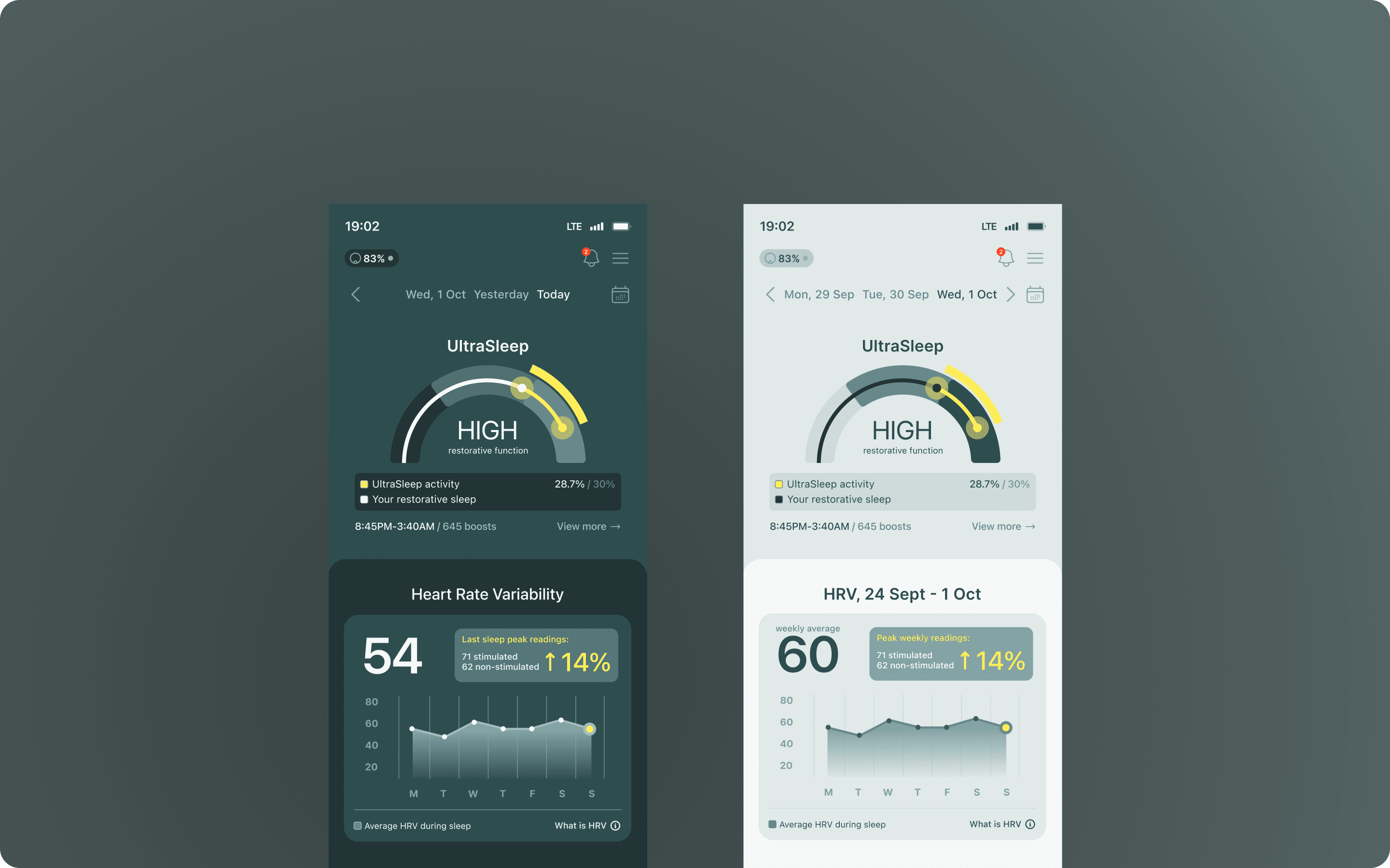
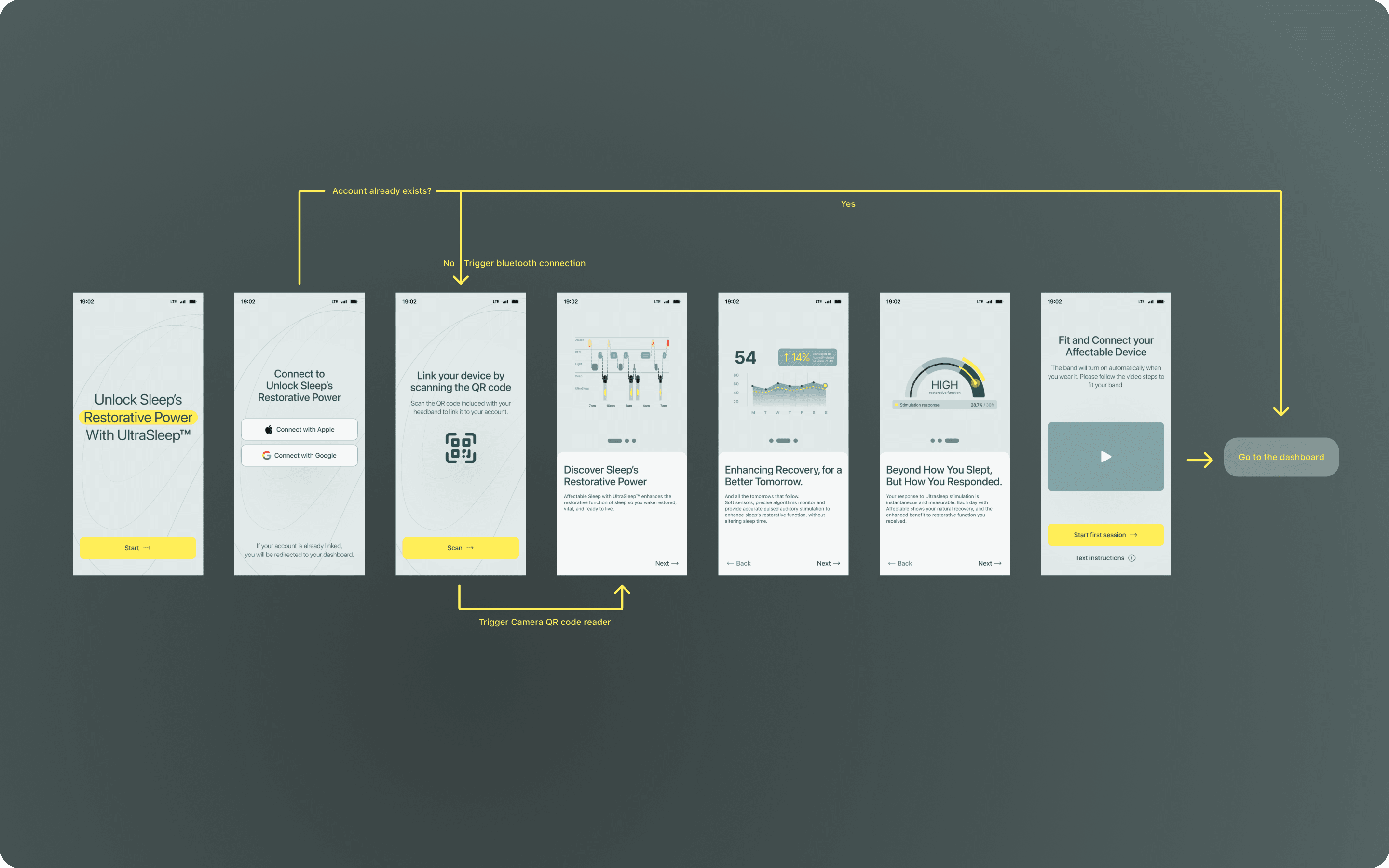
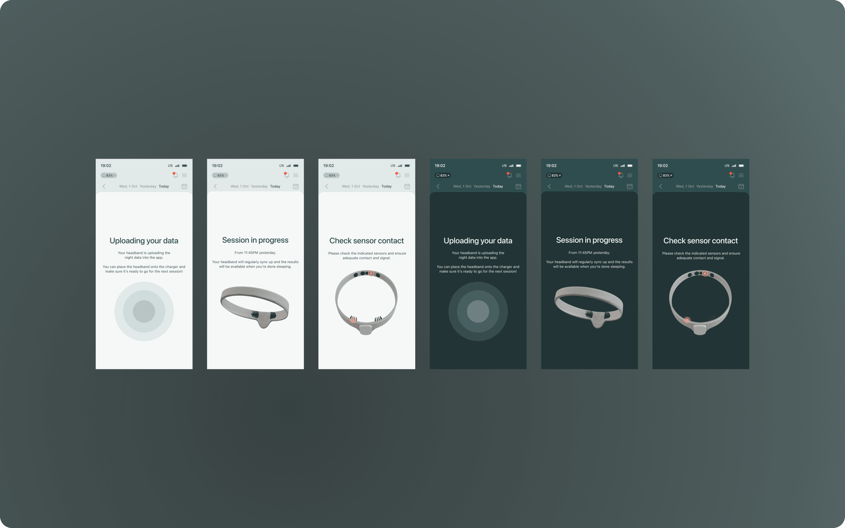
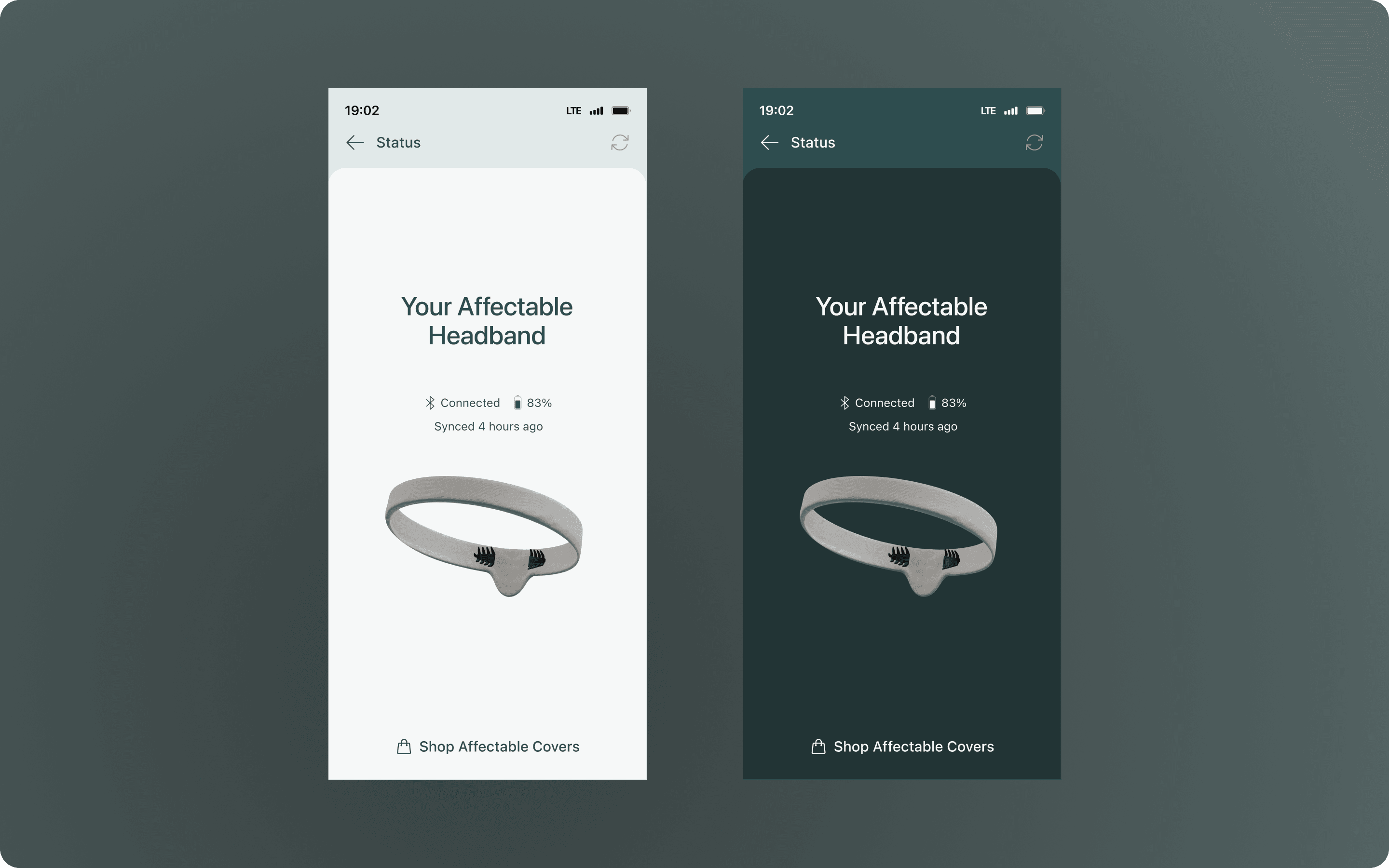
Beyond the main dashboard, the app covers the full user journey. Onboarding walks users through device pairing and fitting. A data breakdown screen sits behind the main view for users — primarily biohackers — who want granular access to sleep stages, HRV readings, and UltraSleep session detail; intentionally separated so it doesn't dominate the experience for those who don't want it. Sensor connection screens handle the moments when electrodes aren't making proper contact, with guidance to resolve fit. A device status screen surfaces battery level and hardware state at a glance. Info drawers were added throughout after research showed users wanted in-context explanations without leaving their current view.
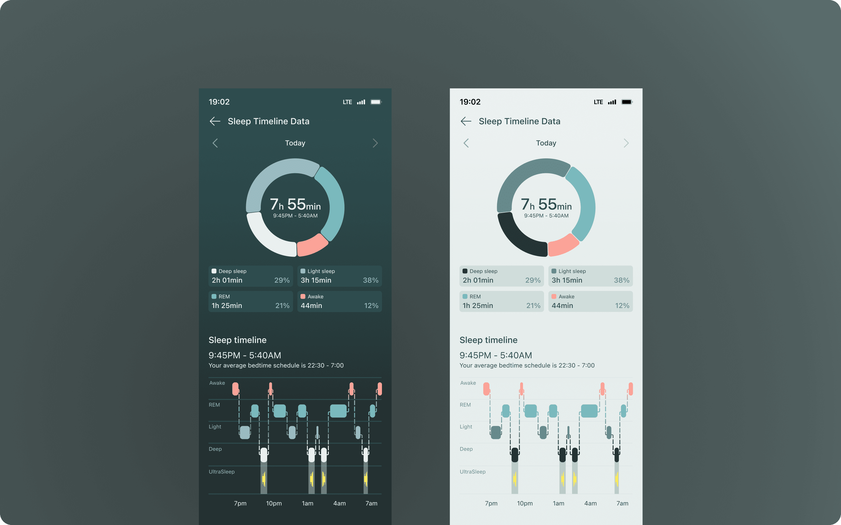
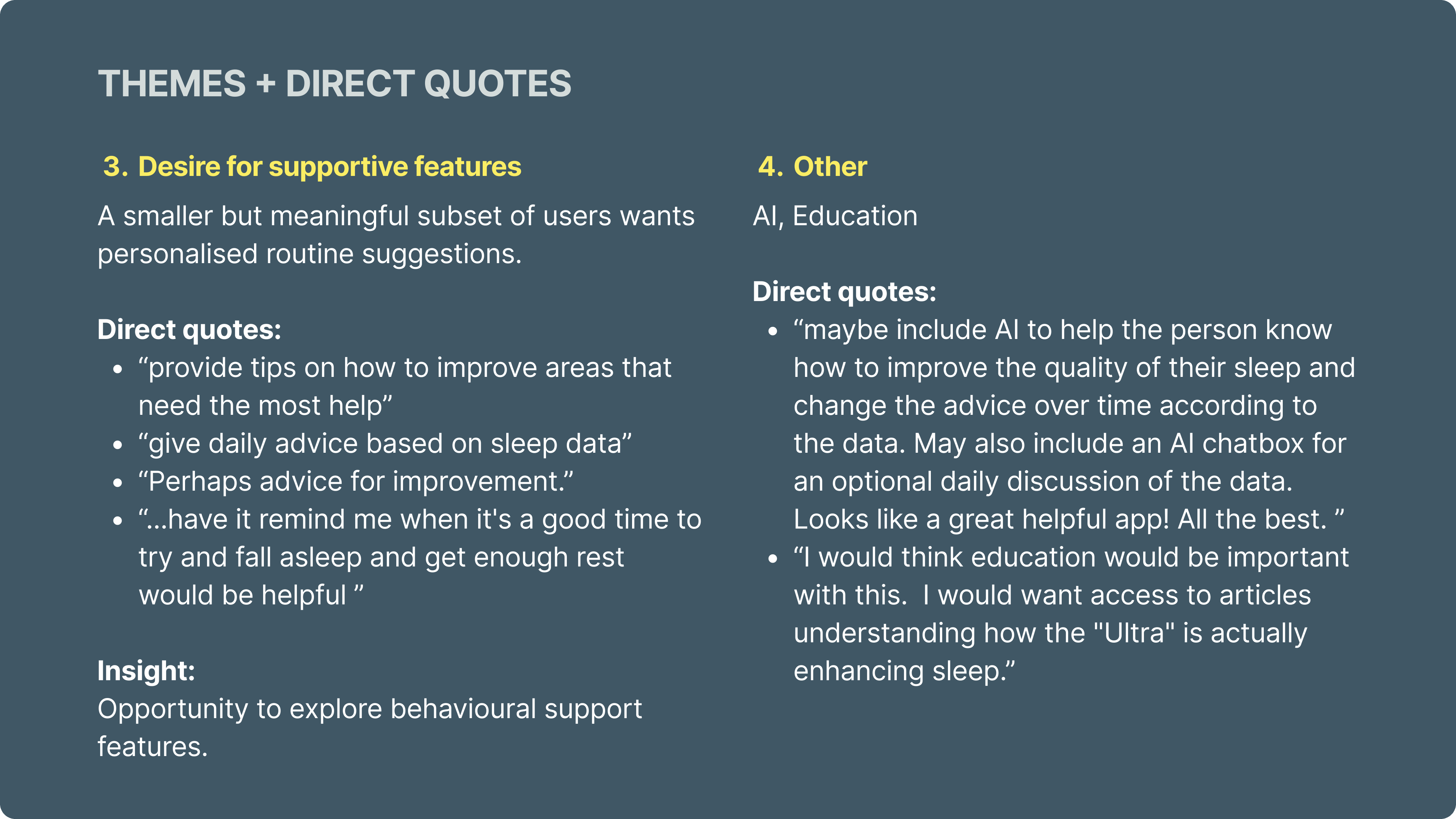
The first research cohort was recruited through Maze and comprised primarily young parents — one of the primary target groups. Four themes emerged directly: visual feedback on colour prompted a round of general visual polish, tightening the brand application throughout. Users wanted in-context education of what they were seeing, leading to info drawers added across the app. There was a clear desire for a concrete number — not a score, but something quantified — which later led to the +xx% figure. Users also flagged the absence of a timeline: they wanted to see how and when their UltraSleep boosts happened, which we added under the main gauge. On top of that, many wanted personalised info which drove the streak area.

The second cohort came from the product waitlist — predominantly biohackers already signed up for the hardware. This group too struggled with Baseline/High etc verabl scores and desired to see some numberical number. The copy and contextual explanations were required as well ans drove the additional drawers and tooltips. And the gauge was also flagged as too complex — specifically the varied colours across Low, Medium, and High sections — leading me to simplify to a single colour treatment. Requests for data export and Apple Health integration were captured and scoped for a post-launch release rather than the beta.


The app is ready for its first beta cohort in May/June 2026, shipping alongside the first wave of Affectable Sleep headbands to early testers. The two research rounds fed directly into the shipped design — clearer boost framing, a simplified gauge, richer in-context data access, improved HRV and added timeline that gives users a meaningful longitudinal picture of their improvement. On top of that, a personalised streak + insights area was added for a more engaging experience. Apple Health integration and data export are scoped for the next release cycle.
Up next — 2020–2025