Up next — 2025–2026
Beyond the Score:Designing an iOS Companion for Next-Gen Sleep Neurostimulation
UX DesignUser ResearchFront-end Engineering
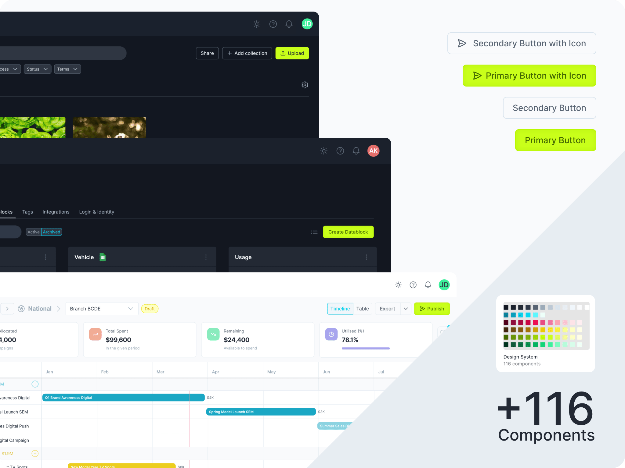
Stellar UI is the design system behind Sesimi's product suite. It pairs a Figma library with a TypeScript / React / Tailwind component library, connected through Code Connect so a component in design maps directly to the component in code. Tokens carry light and dark themes that auto-switch with the active mode, and the whole system is documented for both people and machines — 5 products across 3 React tech stacks build from the same foundation.
Before a shared system, the suite drifted: inconsistent UI across products, slow design-to-dev handoff, no shared tokens, and accessibility handled ad hoc per screen. As AI screen-generation tools arrived, a new gap opened — they would happily produce off-brand, structurally wrong screens because they had no reliable picture of the real components.
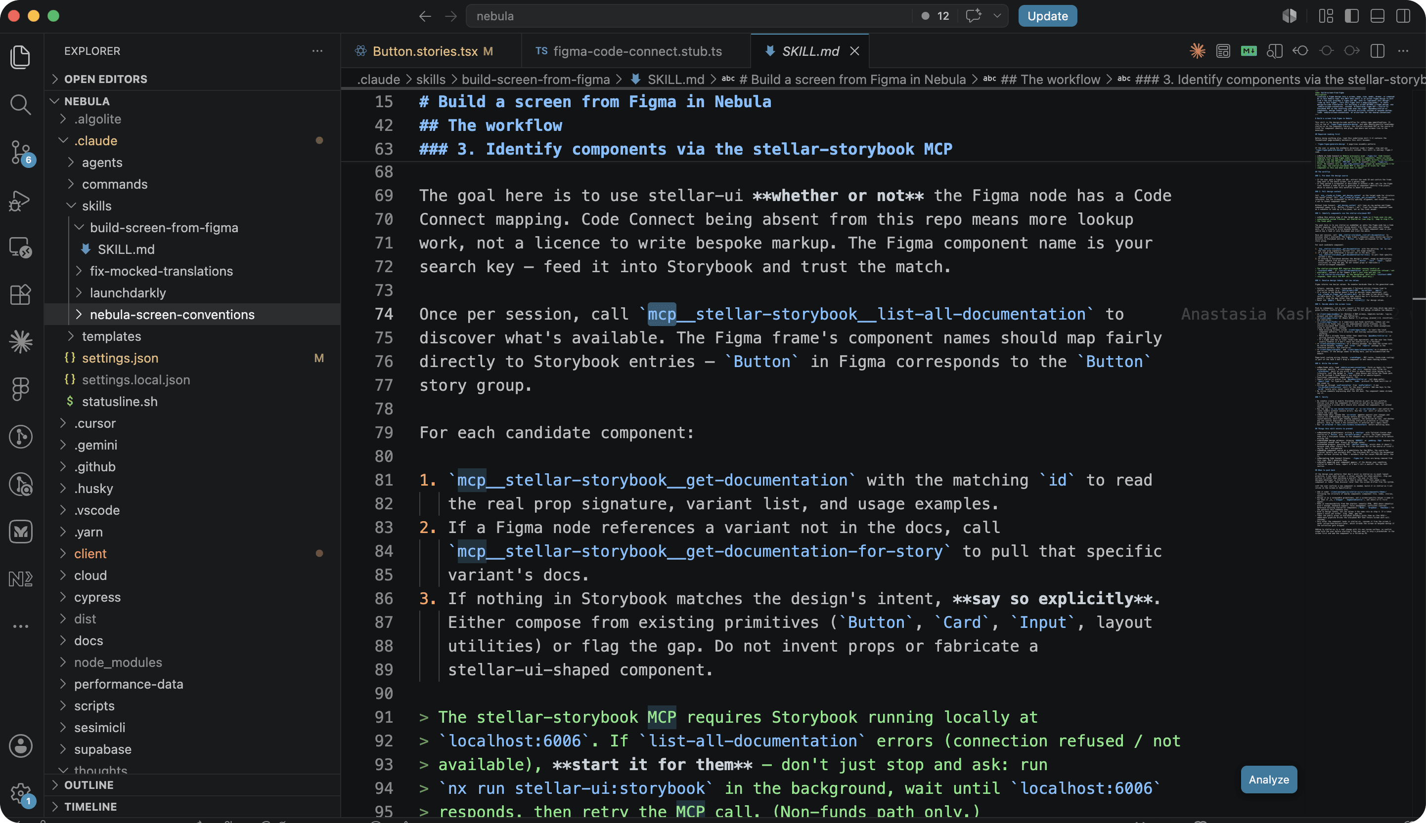
Build one source of truth and keep it honest in both directions. Define tokens and theming in Figma, implement the components in code, and bind the two with Code Connect. Then make the system legible to AI — ongoing maintenance wrapping the Storybook MCP and Code Connect in skills so AI generates screens from the actual library, not a guess.
New screens across 5 products and 3 stacks look and behave consistently, adapt to dark/light mode with no extra work, and ship with accessibility built into the primitives rather than retrofitted. Design-to-dev handoff collapses because design and code reference the same components — and AI-assisted screen generation now produces generally on-brand, correctly-structured output because the tooling reads the real system.
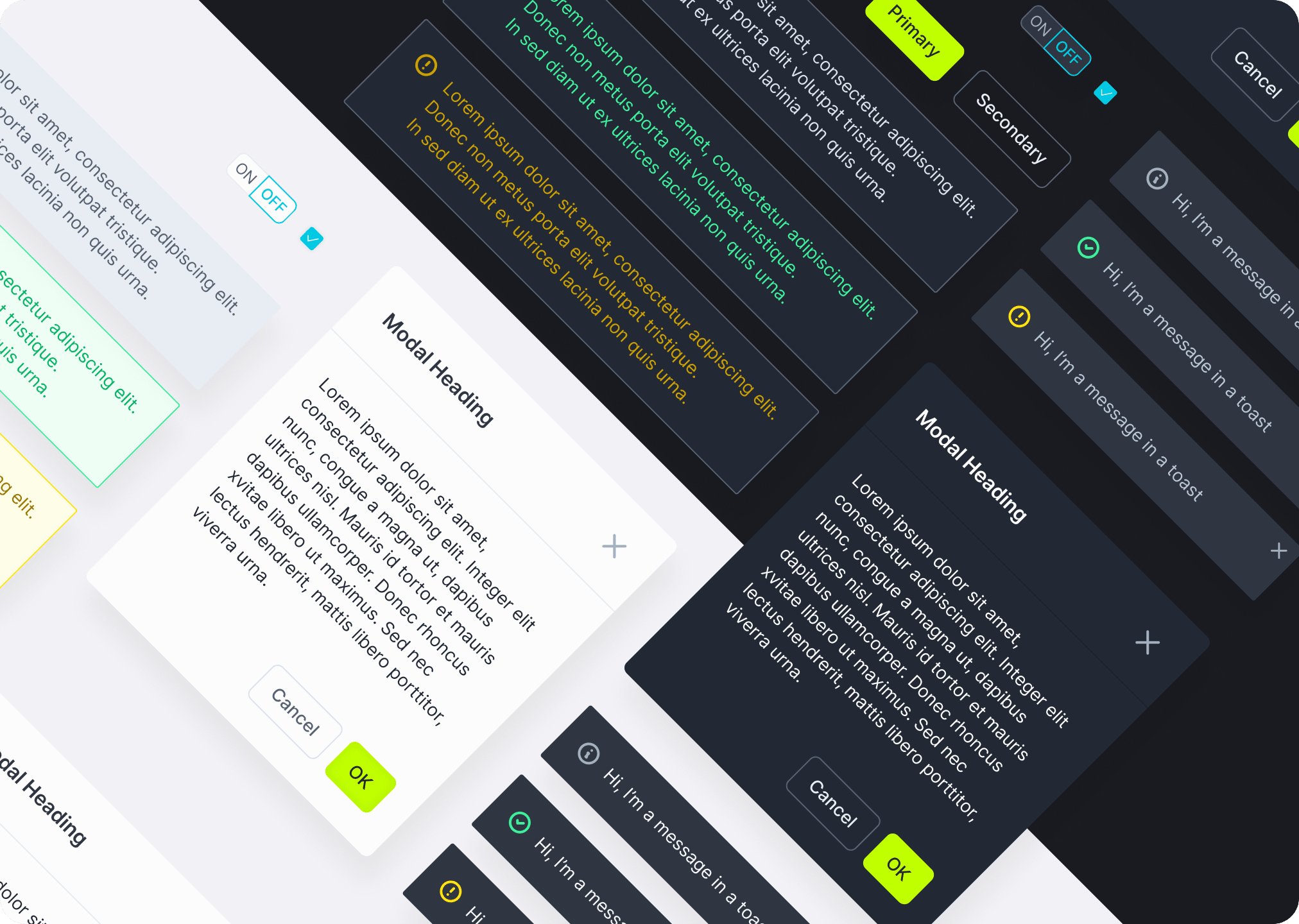
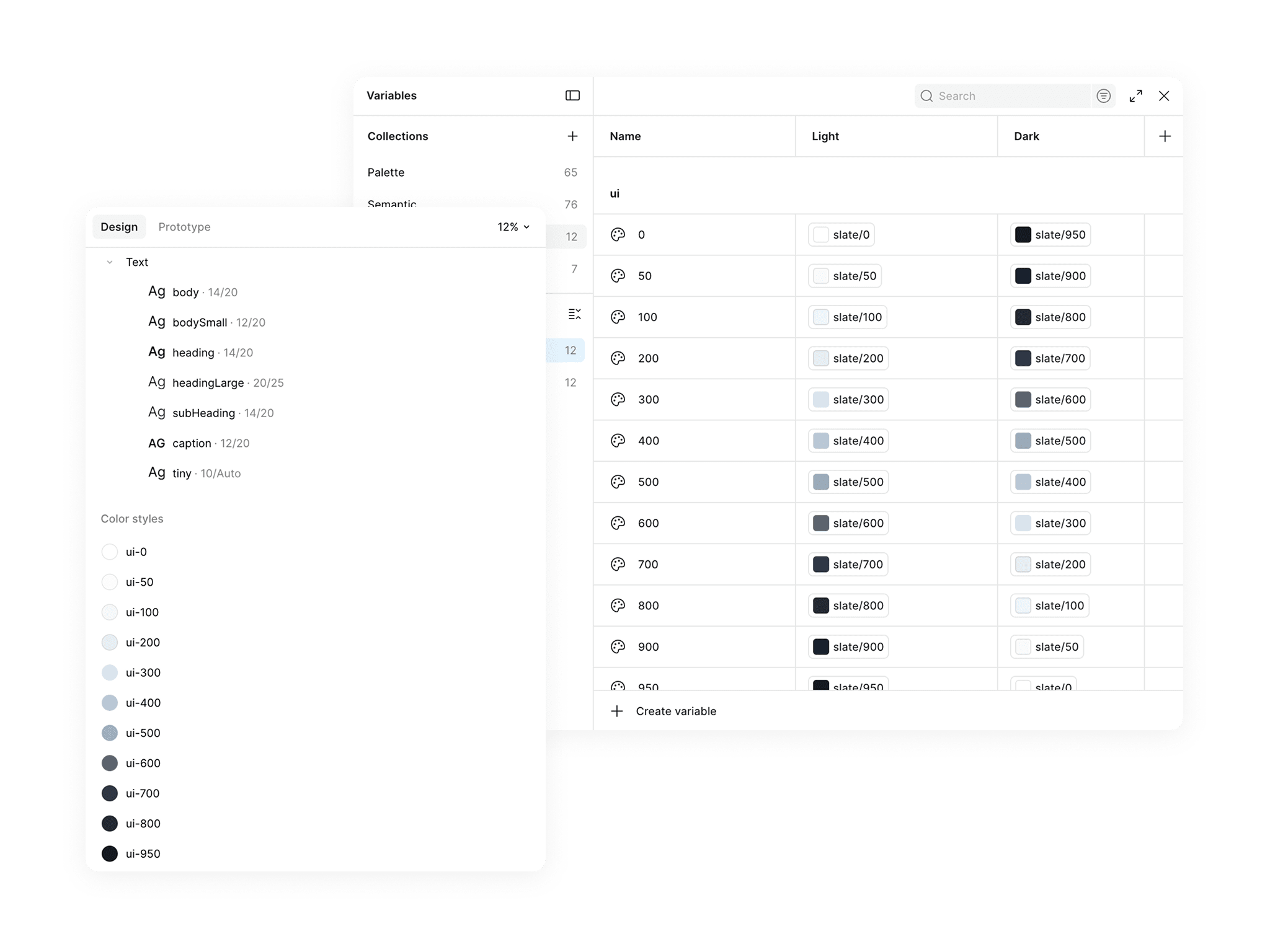
A token layer defined in Figma and mirrored in code carries both light and dark values that auto-switch with the active mode — flip the Figma mode, the UI flips in code, with no parallel overrides on either side. Crucially, the Figma system was built to align with the codebase, not the other way around. The code already had an automatic light/dark switch on the `ui-***` base greyscale values, with semantic Tailwind adjustments per-component on top. The Figma tokens mirror that exactly — a UI Scale mode (greyscale base) and a Semantic mode (per-component overrides), both set to light or dark together. Because theming lives in the tokens, dark mode comes for free on anything built from the system — no second design pass.
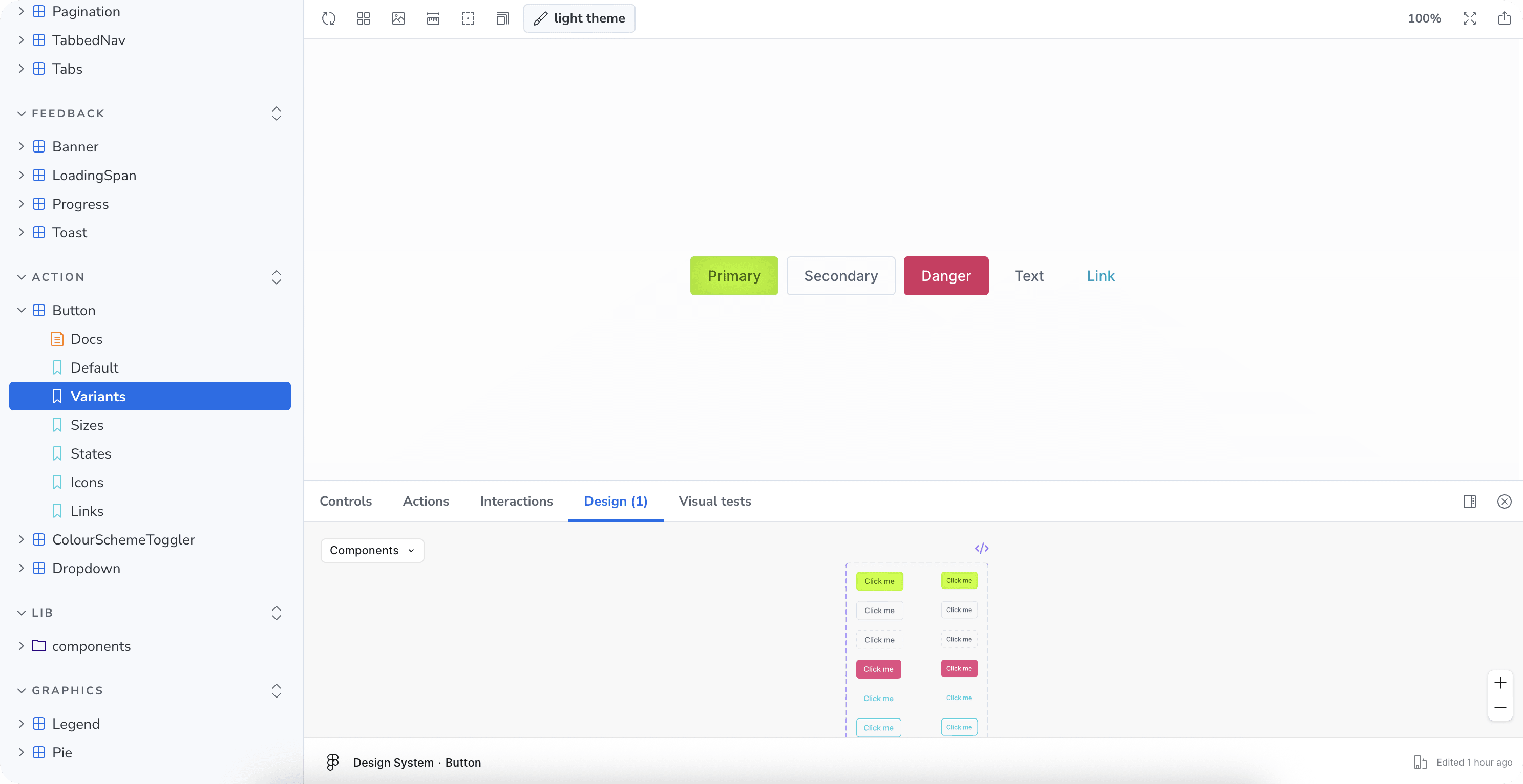
Sesimi's suite spans three separate tech stacks, but they share a common denominator: React on the front end. Stellar UI leans on that — the majority of components are built once in TypeScript, React, and Tailwind CSS and consumed across products, so a button, field, or dialog behaves identically wherever it appears. The components are built to be composable: a single Figma component exposes its props and lets you swap icons and variants from one place, rather than maintaining a combinatorial sprawl of near-duplicate nodes. The payoff is consistency that scales: 5 products draw from the same components, and accessibility is solved in the primitives — focus handling, semantics, and contrast — so every screen built from them inherits it instead of re-litigating it.
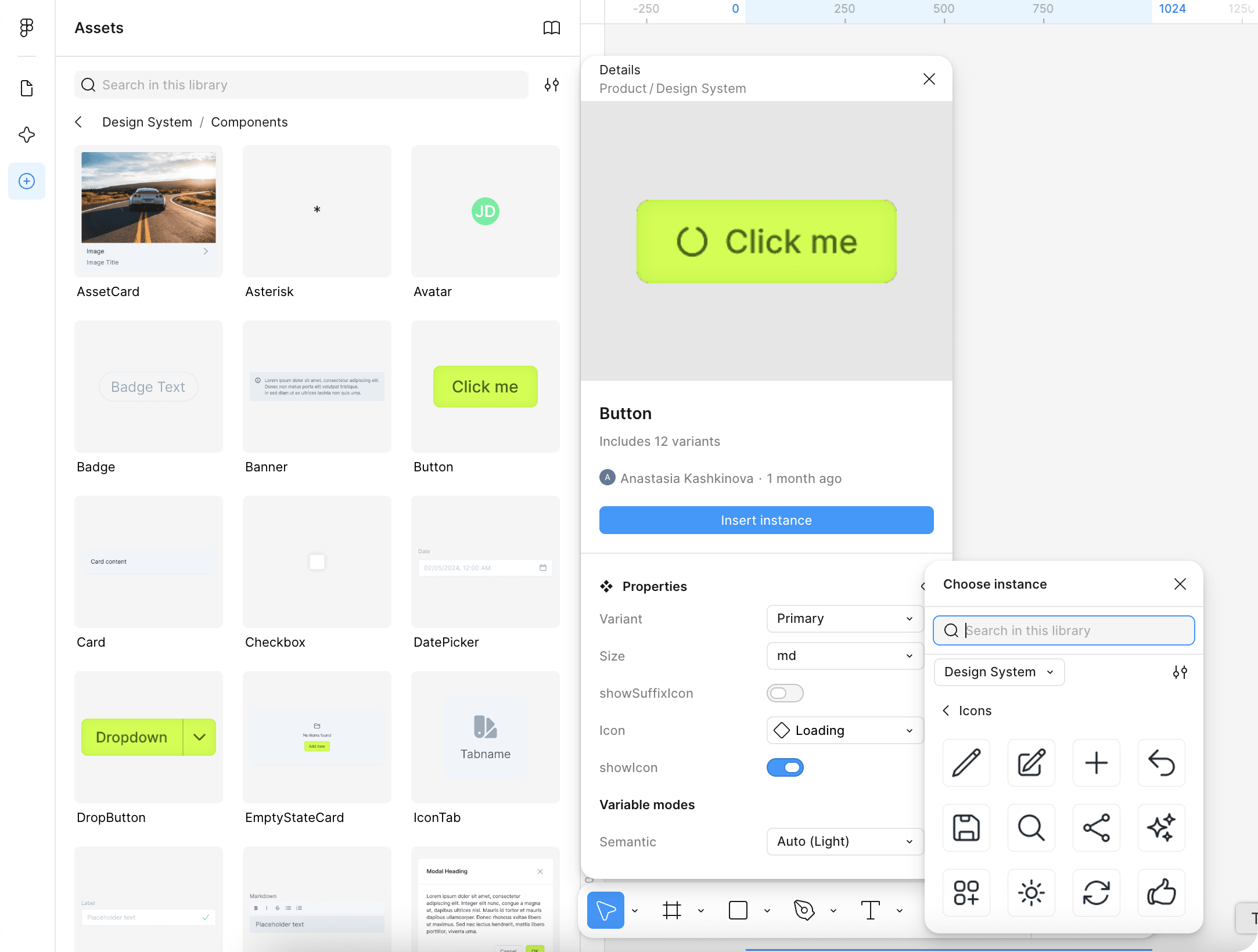
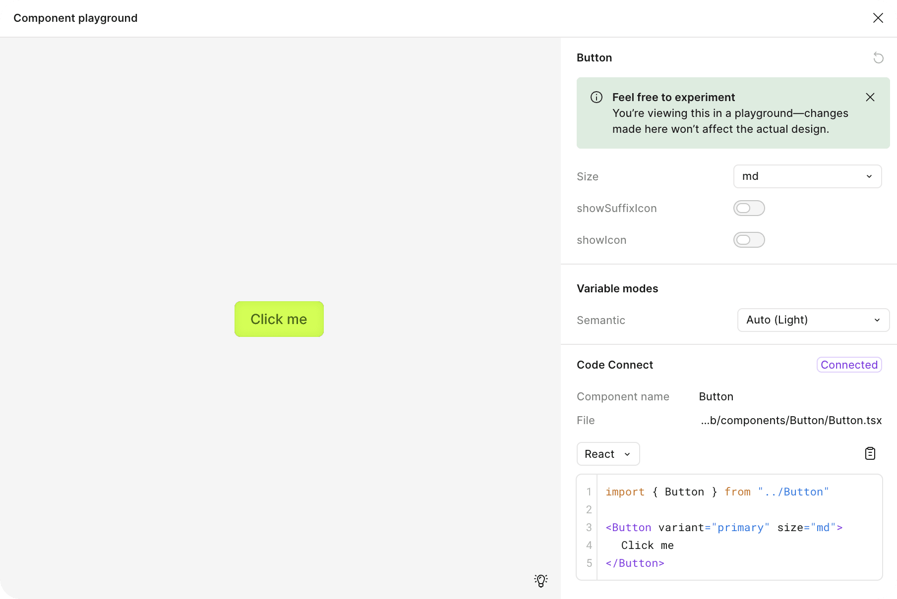
Design systems rot when design and code drift apart. Code Connect binds each Figma component to its real implementation, so the snippet a developer sees in Figma is the component they'll actually import — not a lookalike. Storybook is the living catalogue: every component, its variants, and its states, documented and interactive. It's the reference for engineers building screens and the surface AI tooling reads to understand what the system actually offers.
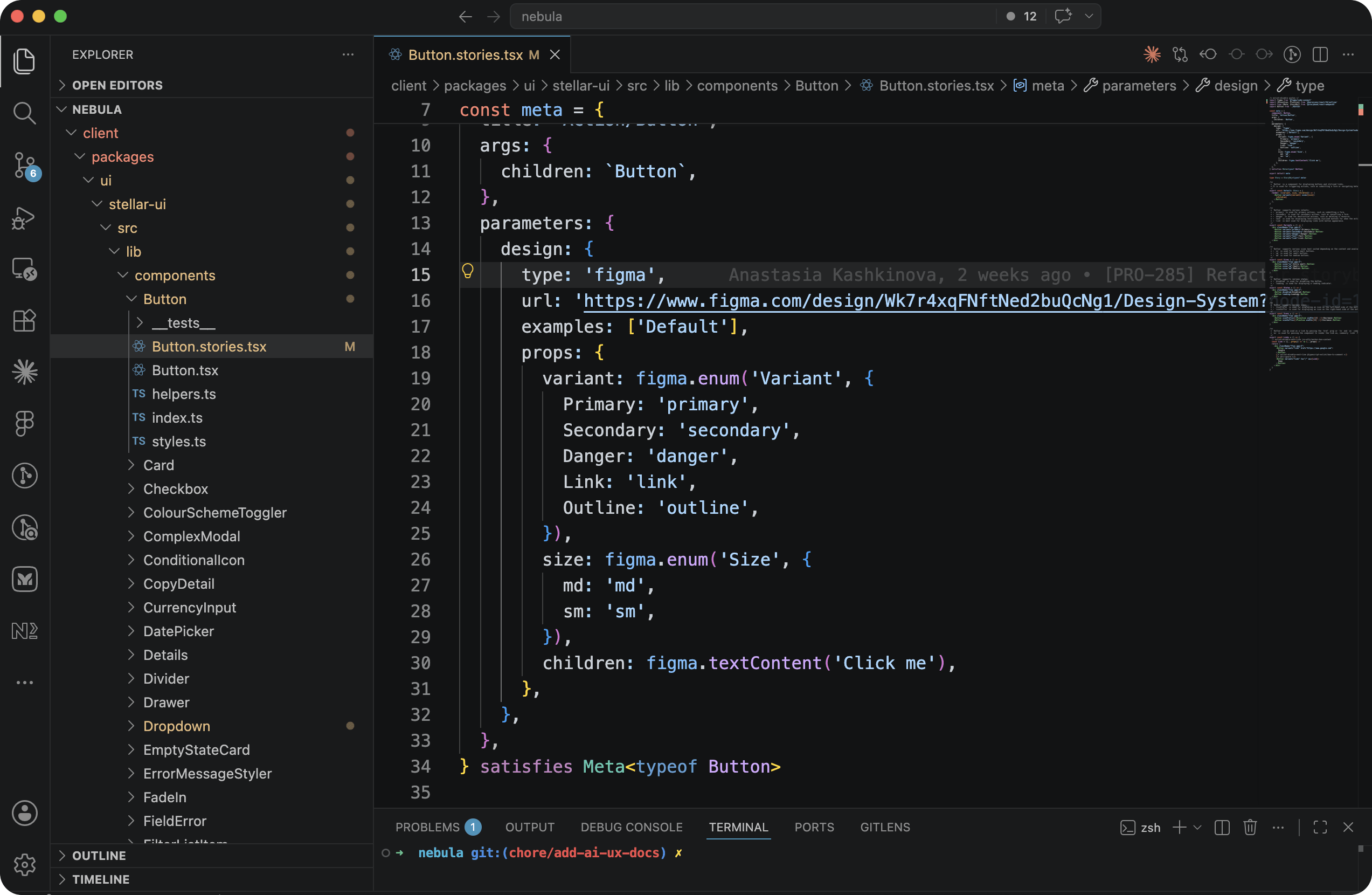
Stellar UI predates the current wave of AI screen-generation tools — but those tools, left alone, generate off-brand, structurally wrong screens because they have no reliable model of the real components. The ongoing work has been to close that gap. The Storybook MCP itself is largely off-the-shelf — the work was wrapping it. I wrote skills around the Storybook MCP and Code Connect so that when AI is used to build a screen, it reliably reaches for the real Stellar components — with correct props, variants, and structure — instead of inventing lookalikes. The result is generation that respects the system's constraints and produces on-brand, accessible, theme-aware output rather than a plausible-looking approximation.
Up next — 2025–2026