Up next — 2025–2026
Beyond the Score:Designing an iOS Companion for Next-Gen Sleep Neurostimulation
UX DesignUser ResearchFront-end Engineering
Client
Redbubble
Role & Contributions
Front-end Engineering, Design Systems
Timeline
2020
Tools
React, CSS, Playroom, GitHub, Figma
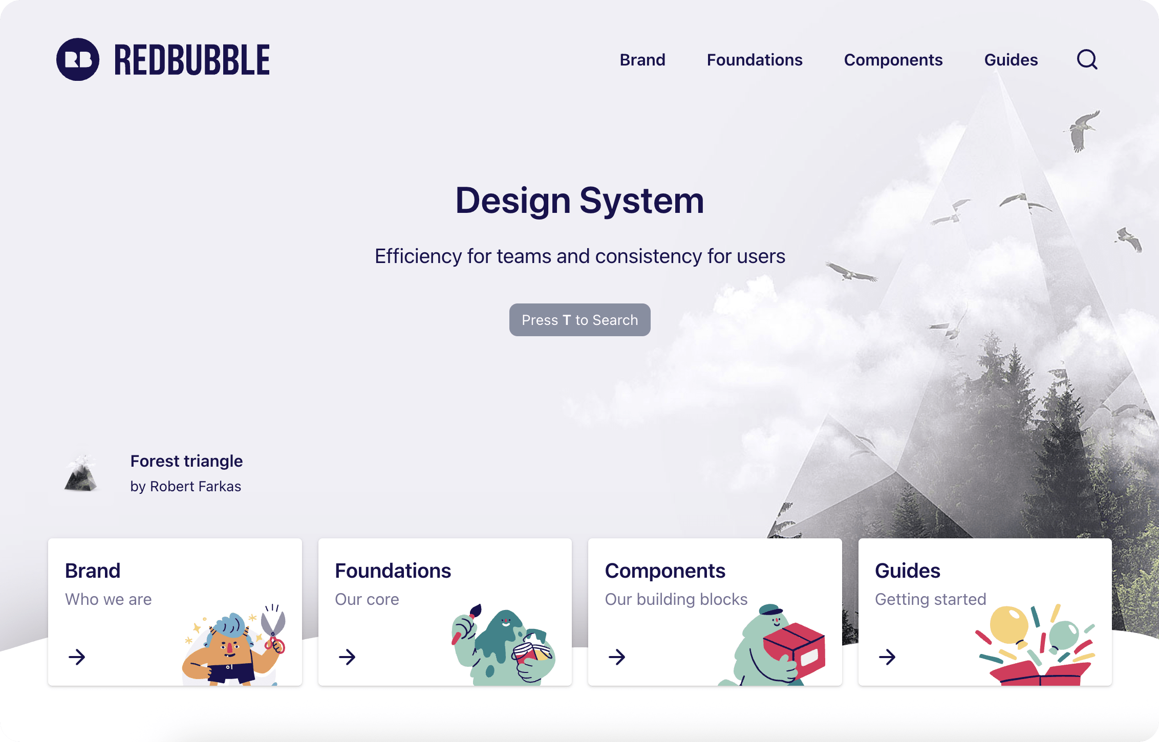
Redbubble is a global marketplace for independent artists — a platform that spans dozens of product surfaces and is built by multiple squads in parallel. I joined the design system team as a front-end engineer, working on both the React component library and the documentation layer that product teams depend on day to day.
A fast-growing platform with multiple product squads but no unified component story — leading to inconsistent UI patterns, duplicated implementations, and accessibility gaps that accumulated across team boundaries. The design system team's mandate was to close those gaps without disrupting squads actively shipping product.
Worked across the full system lifecycle: triaging and resolving GitHub-reported component issues, building interactive prototypes in Playroom directly from design specs, refactoring components for accessibility compliance, and authoring layout documentation with production-ready code snippets for the broader engineering org.
The design system team operated with a lean headcount and a dual mandate: maintain the React-based UI component library used across product squads, and run the documentation platform that made it discoverable and usable. Both halves had to move in lockstep — a component update without corresponding documentation created its own kind of inconsistency. Redbubble's scale meant that any change to a shared component had wide blast radius. The work required discipline around backwards compatibility, clear changelog communication, and close coordination with the design team to ensure code stayed in sync with design intent.
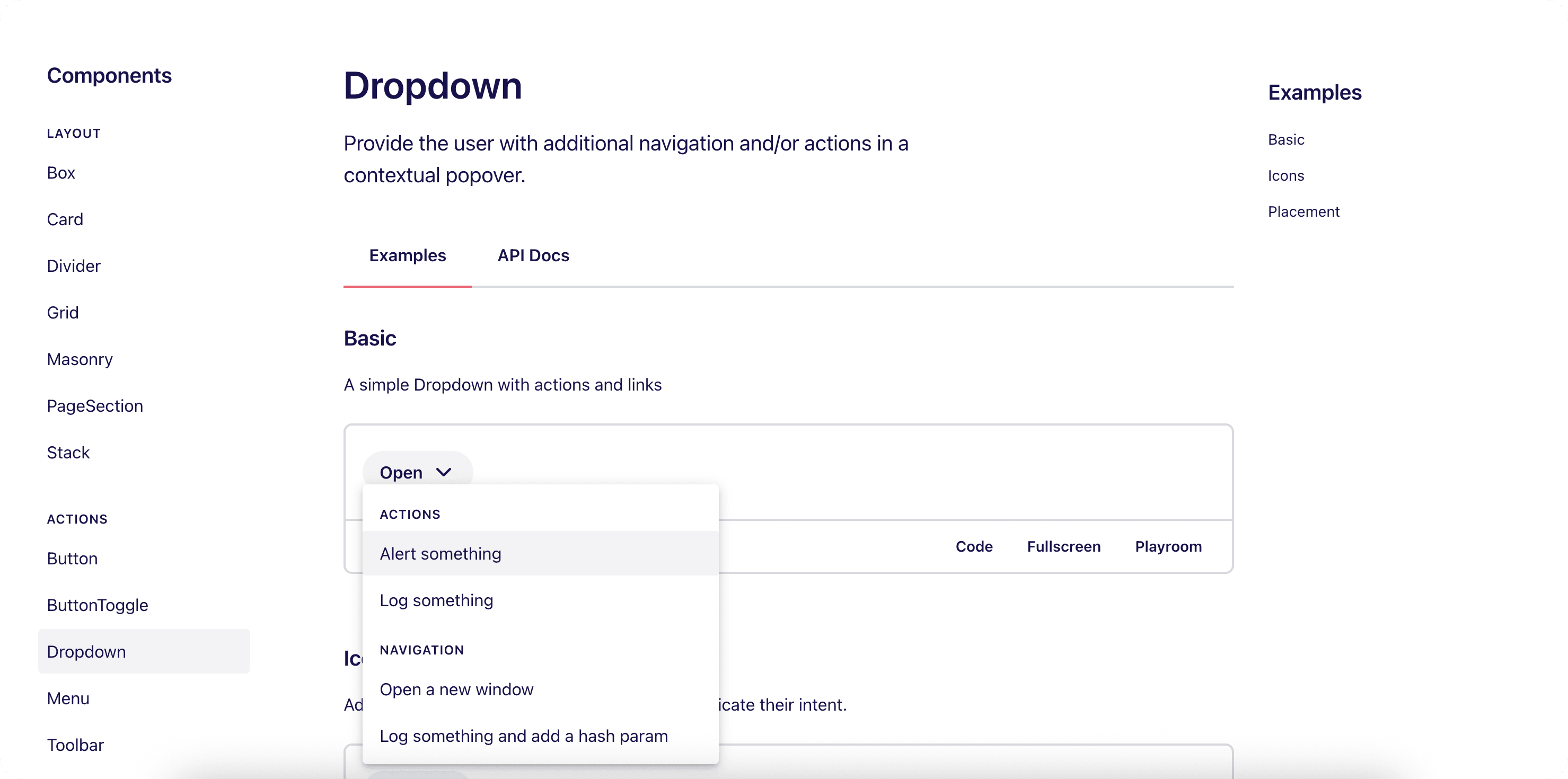
A significant part of the role was reactive: triaging issues reported by product engineers who hit edge cases in shared components. The dropdown was a good example of the two types of problems that came up. The first was technical: the dropdown was being clipped when used inside a modal, because it rendered within the modal's stacking context. Fix was a React portal to position it correctly in the document root. The second was a UX issue: users didn't know the list was scrollable because a full 8 items filled the container with no visible overflow. Setting the max height to show 8.5 items — a half-item peeking below the fold — made the affordance self-evident without any additional UI.
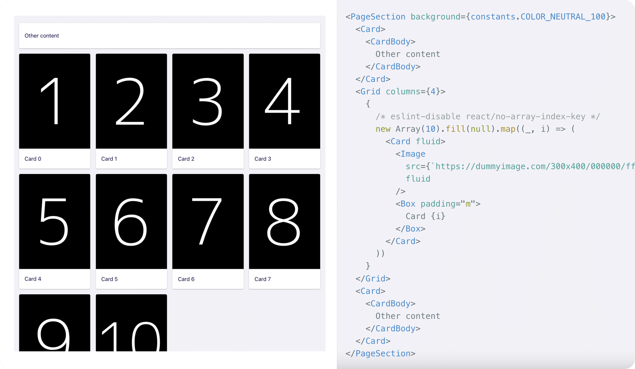
Playroom is an open-source prototyping tool by Seek that renders live JSX against your actual component library. Redbubble had it integrated directly into the design system — powering the live component previews in documentation and providing a prototyping environment constrained to only what the system exposed. That constraint was the point: prototypes couldn't reach outside the design system, so they were an accurate test of whether a design was achievable with the components that actually existed. Edge cases surfaced early, before squad engineers hit them in production.
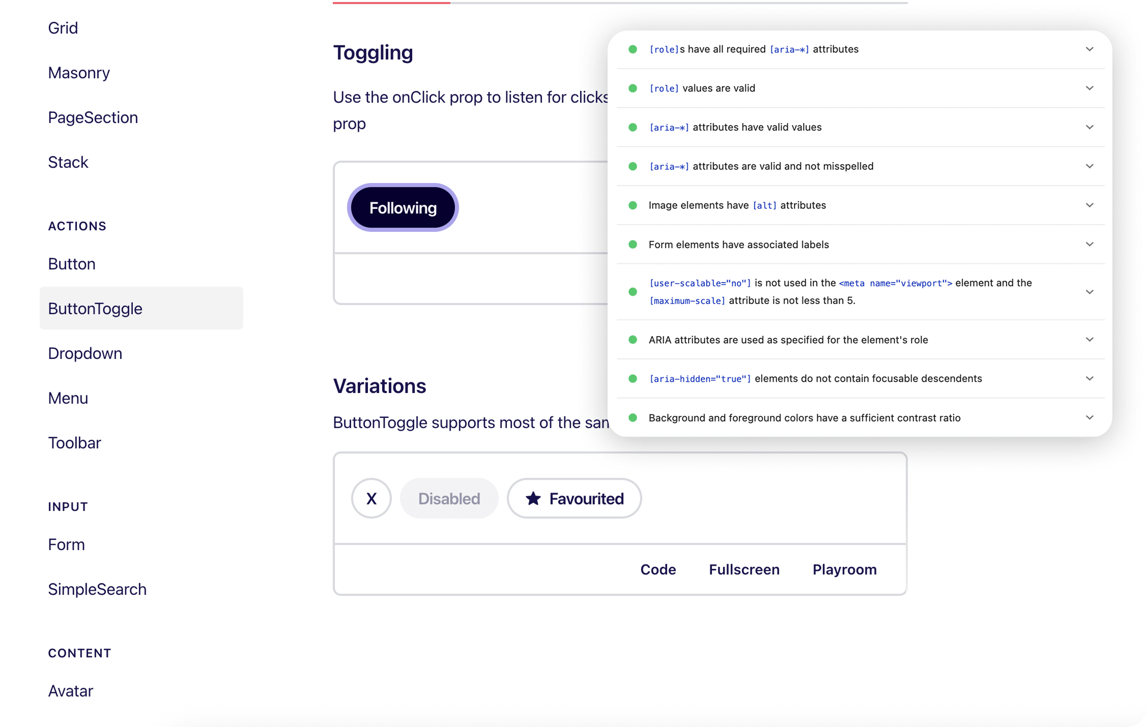
A subset of components had accumulated accessibility debt — missing ARIA attributes, keyboard navigation gaps, and missing or broken focus states. I refactored these to meet WCAG 2.1 AA, testing with keyboard-only navigation and VoiceOver, with Lighthouse audits as a sanity check. The compounding return of fixing it in the shared library: every surface using the component inherits the fix without additional work from squad engineers.
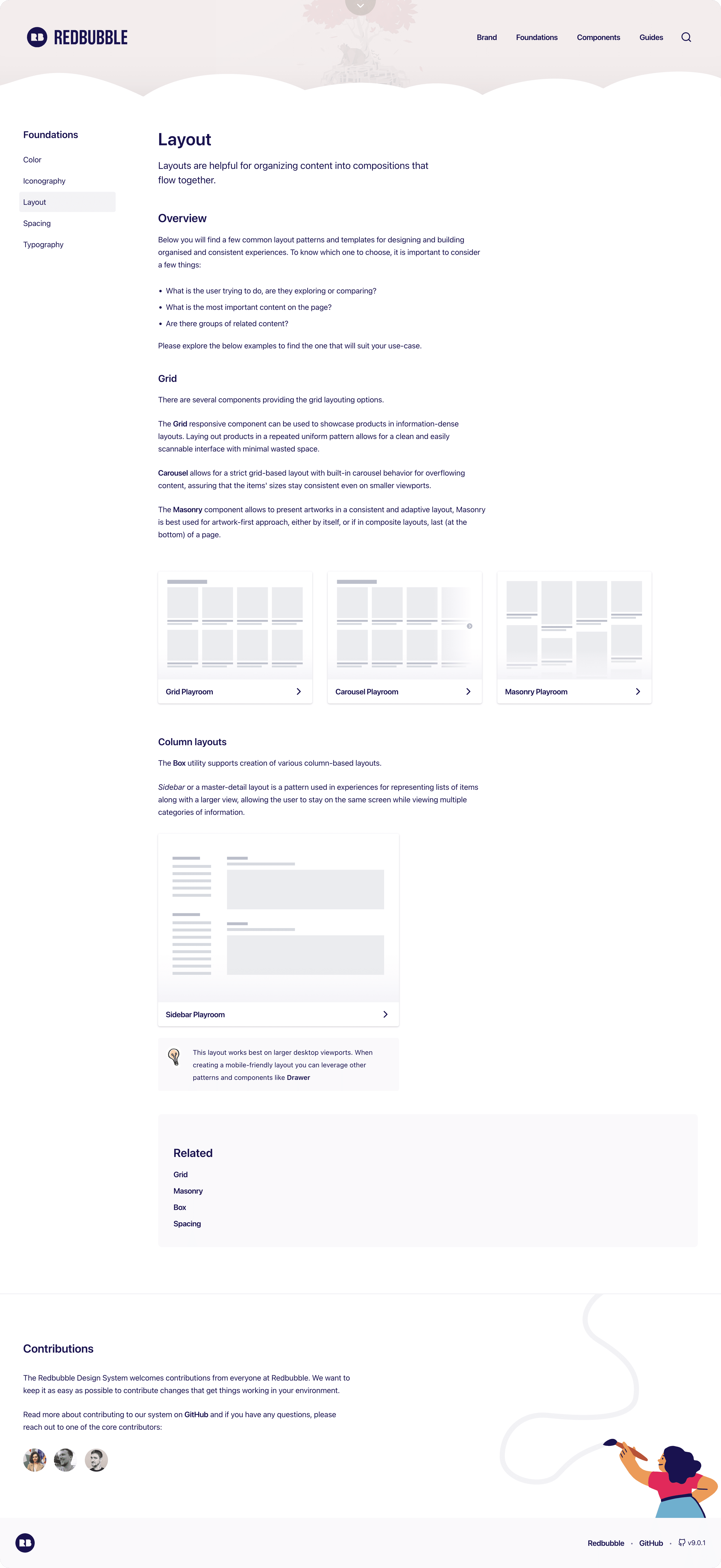
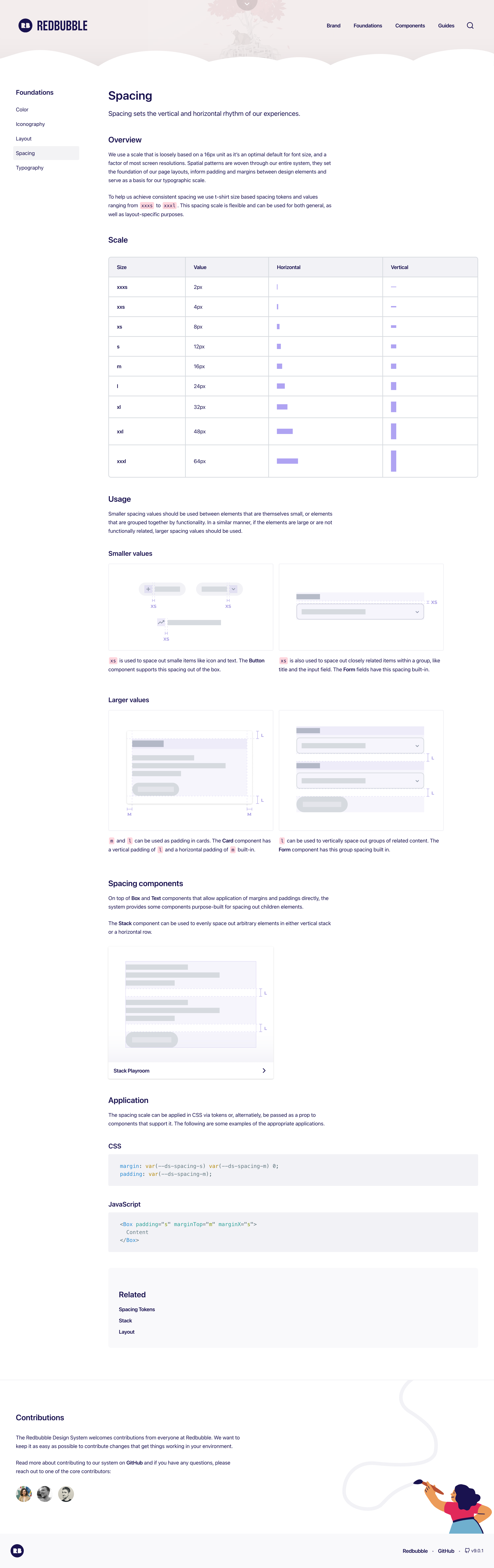
I authored the layout and spacing documentation from scratch — writing the content, creating the visual thumbnail representations, and wiring up the Playroom examples so engineers could jump straight to a working, copy-paste-ready starting point. Good system documentation reduces support load: engineers who can find a clear usage example with live code don't need to file an issue or ask in Slack. The thumbnail visuals also mattered — scannable previews mean engineers reach for the right primitive faster.
Up next — 2025–2026