Up next — 2020
Engineering, Docs, and Everything Between:Redbubble's Design System
Front-end EngineeringDesign Systems
Client
Sider
Role & Contributions
UX Design, Front-end Engineering, User Research
Timeline
2017–2019
Tools
Figma, React, SCSS, Slim, GitHub, Hotjar
Sider (prev. SideCI) was a static code analysis tool that integrated with GitHub via webhooks and the Commit Status API — when a pull request was opened, GitHub notified Sider, linters ran automatically, and results posted back as a commit status check directly on the PR. It ranked in the top 10 code quality tools on GitHub Marketplace. I joined as UI/UX designer and front-end developer in 2017, working across the platform for two years as the product and team grew.
The platform had grown in layers — navigation across sections was getting harder, the core PR view became hard to scan as issue lists scaled, and new users had no guided path to get their first repository connected.
Worked incrementally across multiple surfaces: an onboarding flow early after joining, filtering and navigation improvements to the core PR view, and a dashboard redesign as teams scaled across more organisations and repositories. Design and front-end implementation ran in parallel.
Over two years: shipped onboarding, iterative improvements to the PR issue view and header navigation, and a dashboard redesign — all implemented directly in React and SCSS. Supported the addition of 8+ new linters. The platform grew from around 1,000 to 4,000 monthly active users, across 200–300 organisations including universities and engineering teams of varying sizes. The business was ultimately acquired by a large Japanese software firm and rolled into their enterprise offerings — a strong signal the product had found real traction.
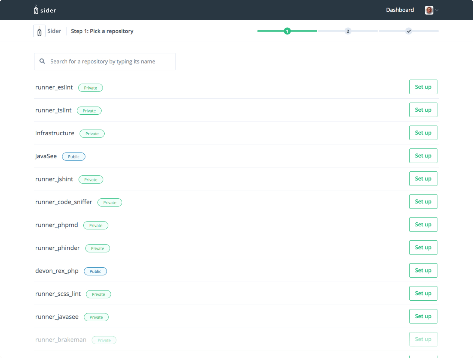
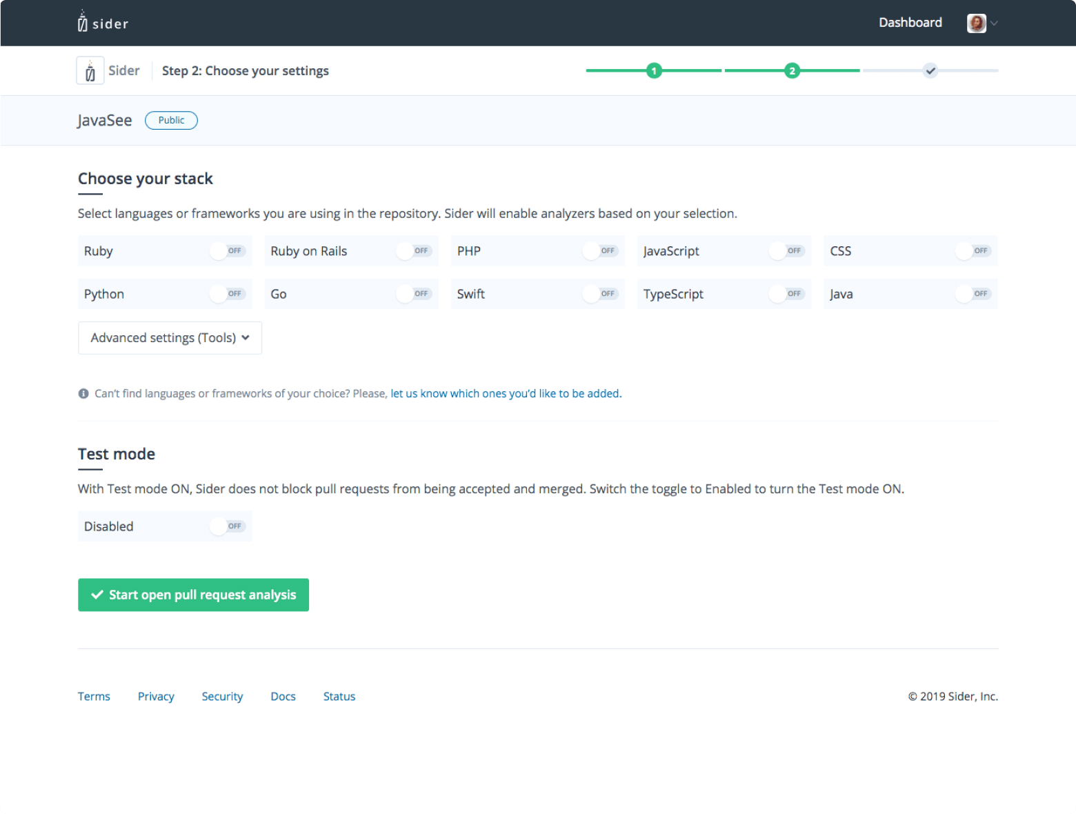
Sider required GitHub OAuth and repository configuration before engineers could see any value — friction that consistently affected early activation. One of my first projects after joining was designing a guided onboarding flow to get users from sign-up to their first connected repository. The flow was intentionally short: OAuth, select a repository, confirm configuration. The goal was to reach the first real result — a set of appropriate linters running against an open pull request — as quickly as possible.
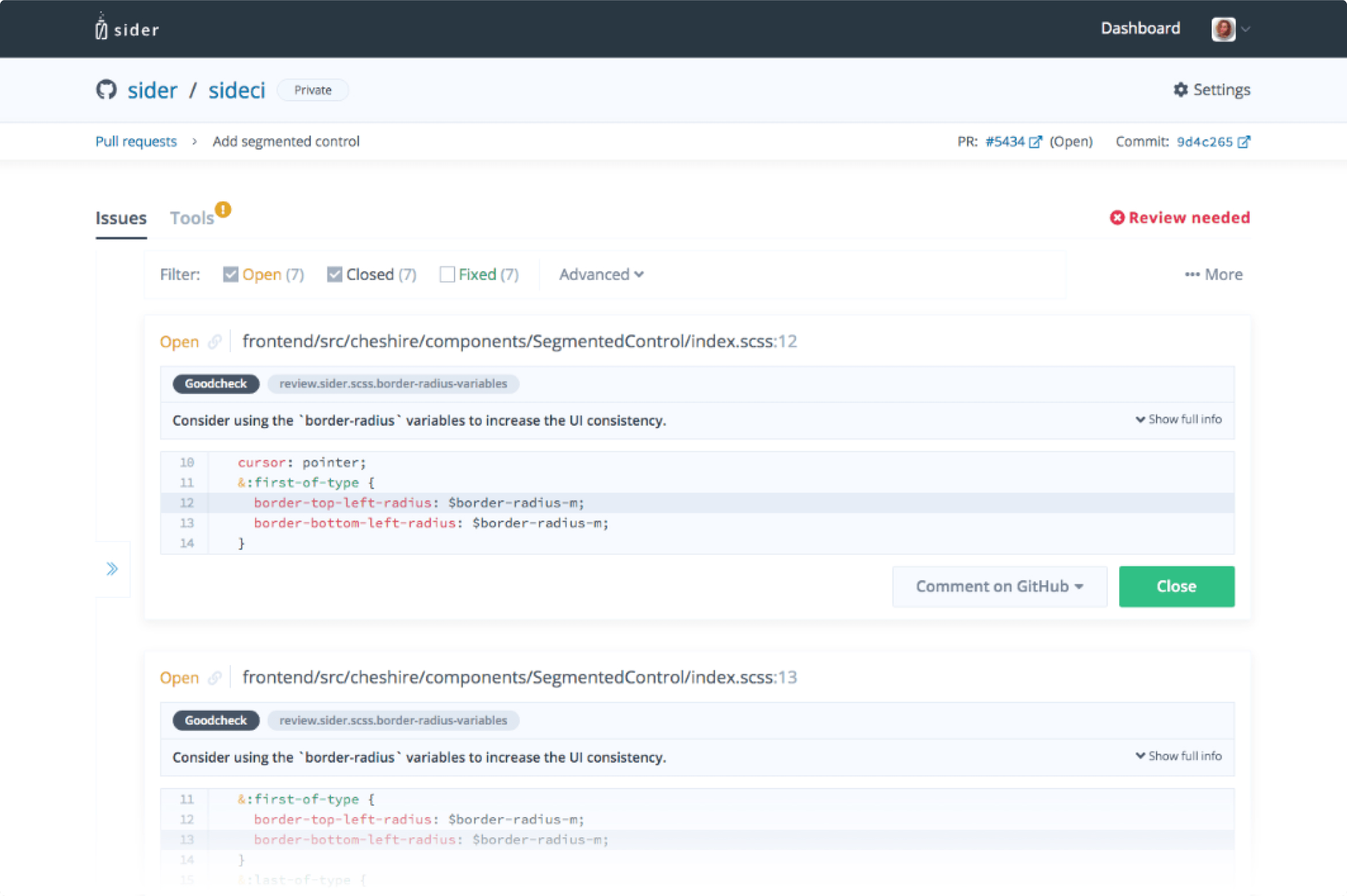
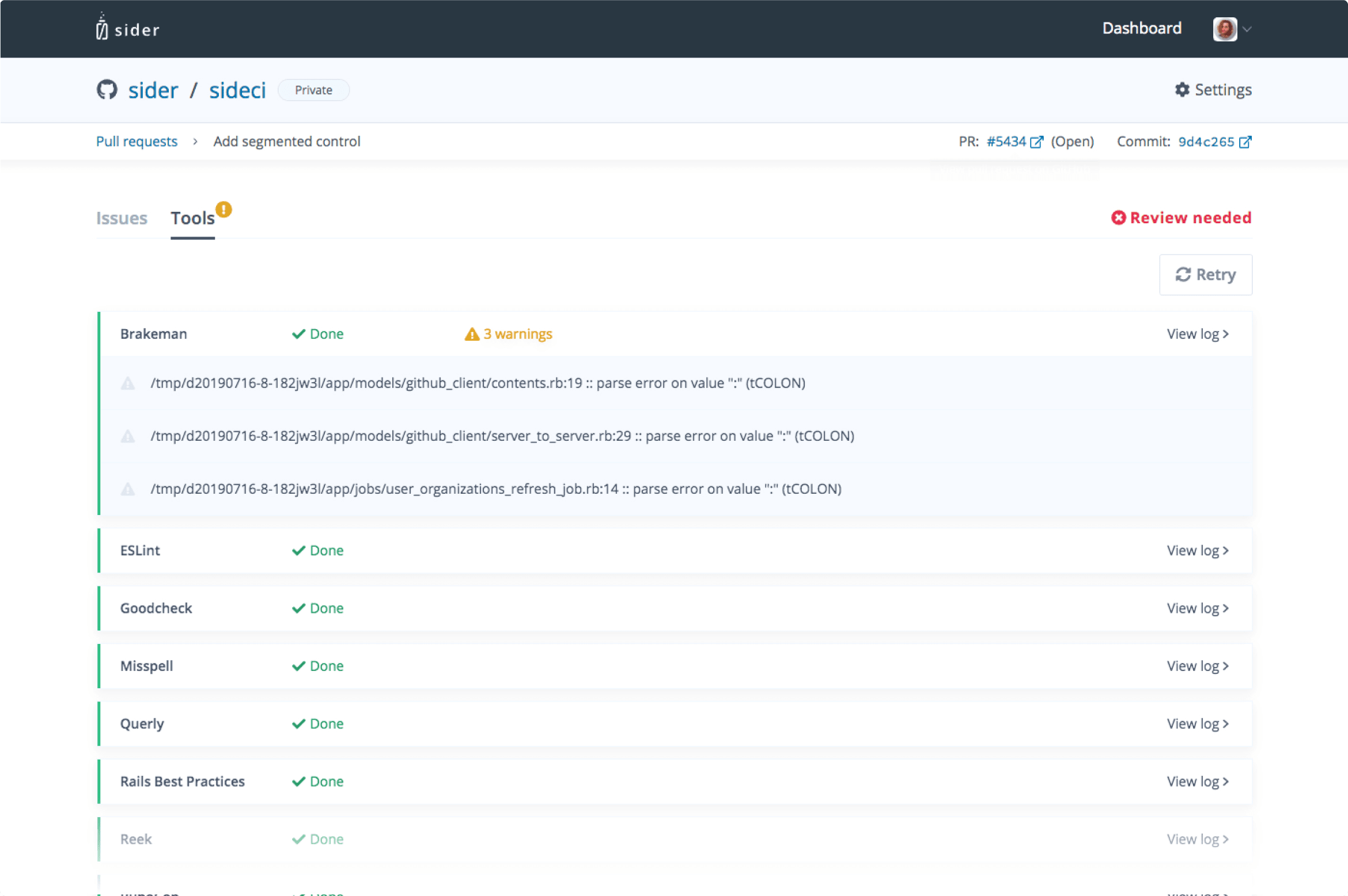
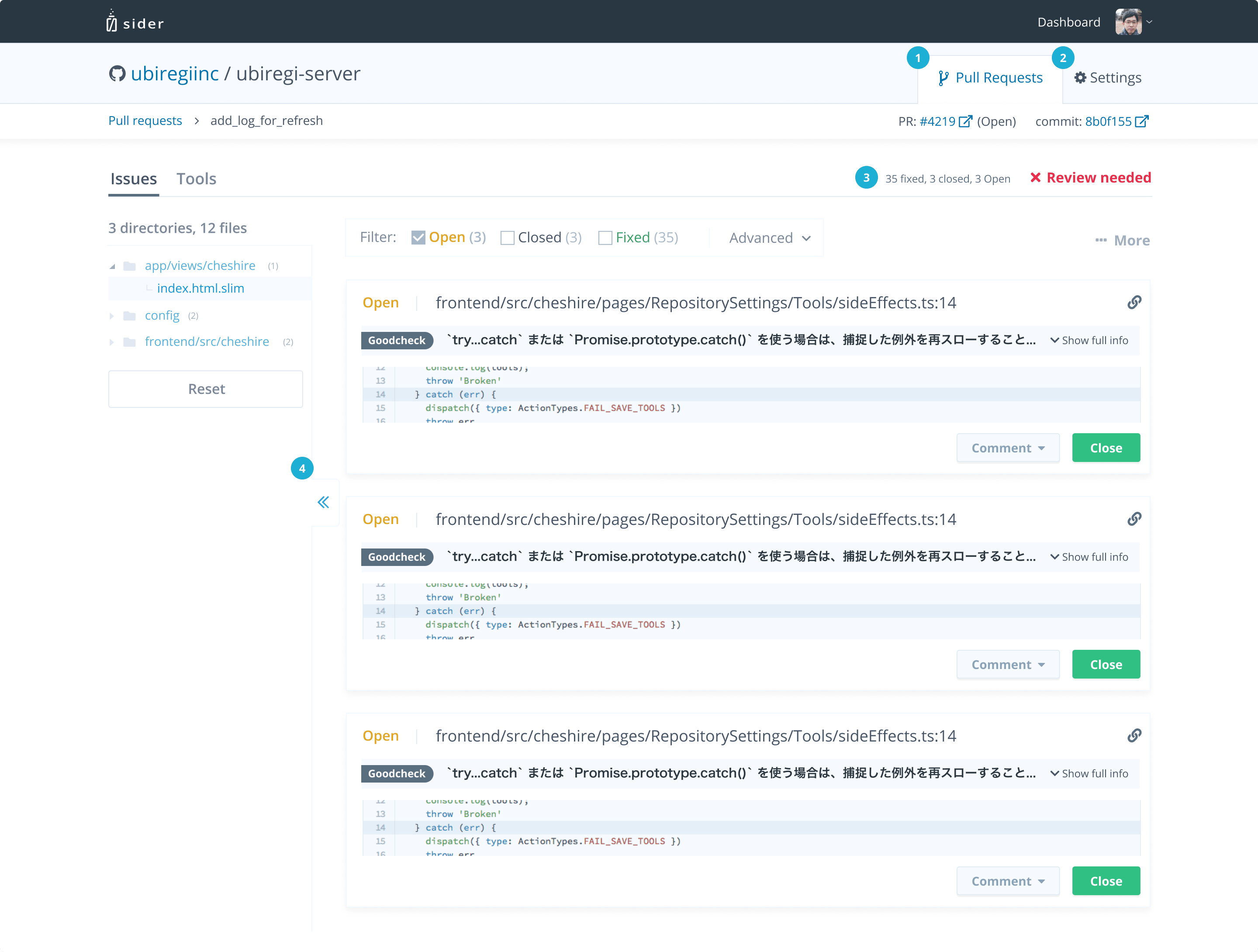
The primary surface of Sider was the pull request issue view — what engineers landed on after clicking through from a GitHub PR check. It listed every issue the linter had flagged: file, line, rule, severity. Manageable with a handful of issues, but increasingly hard to navigate when a single rule triggered across hundreds of files. The work here was structural: filtering by issue type and file, plus a collapsible tree navigation panel to give engineers spatial orientation within long lists without constant scrolling. A dedicated tools tab surfaced linter configuration and access to logs.
The two core repository-level screens: the PR list for a given repo, and the settings and tools configuration page. Standard surfaces, but the ones engineers spent the most time on day-to-day.
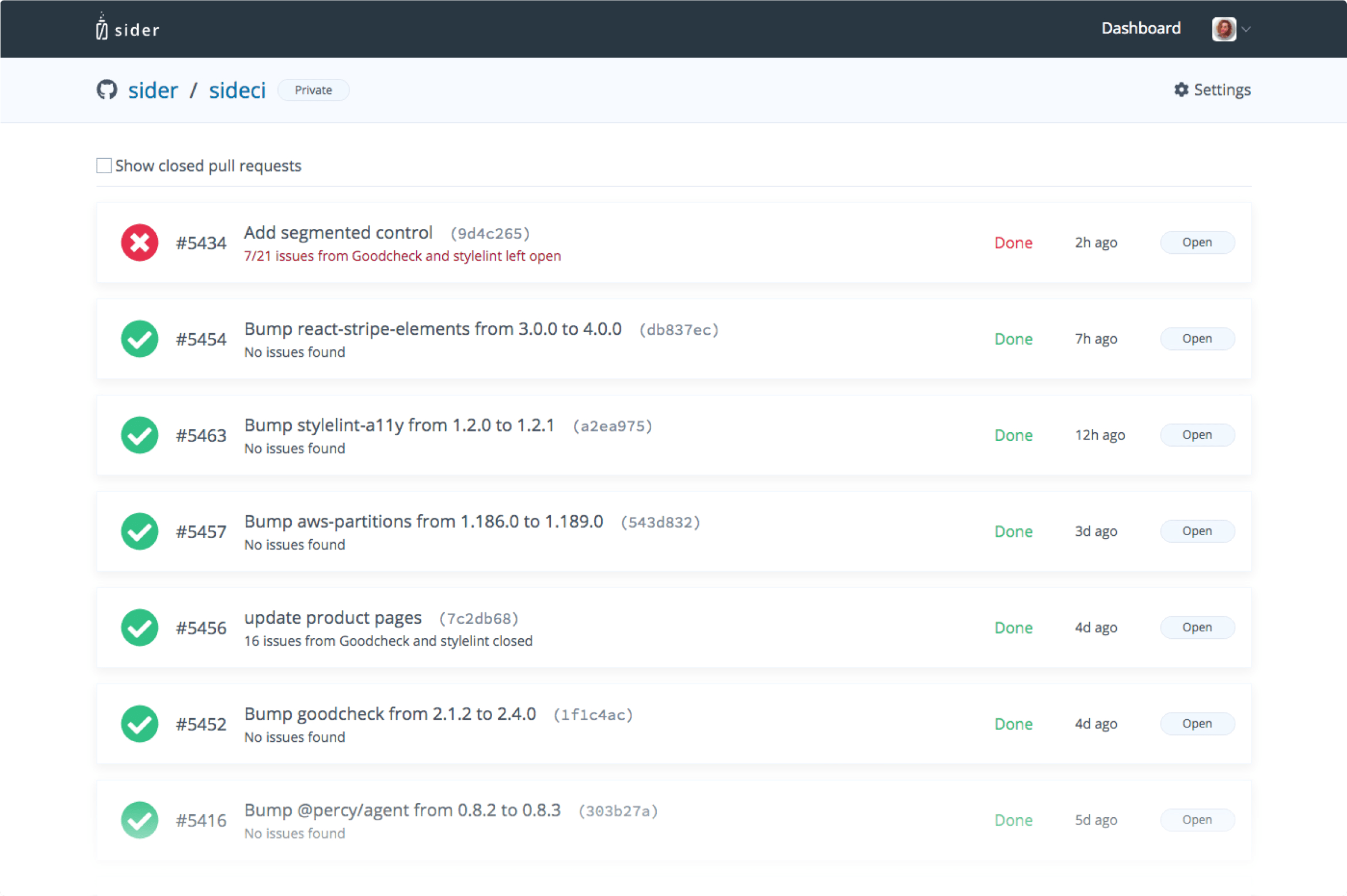
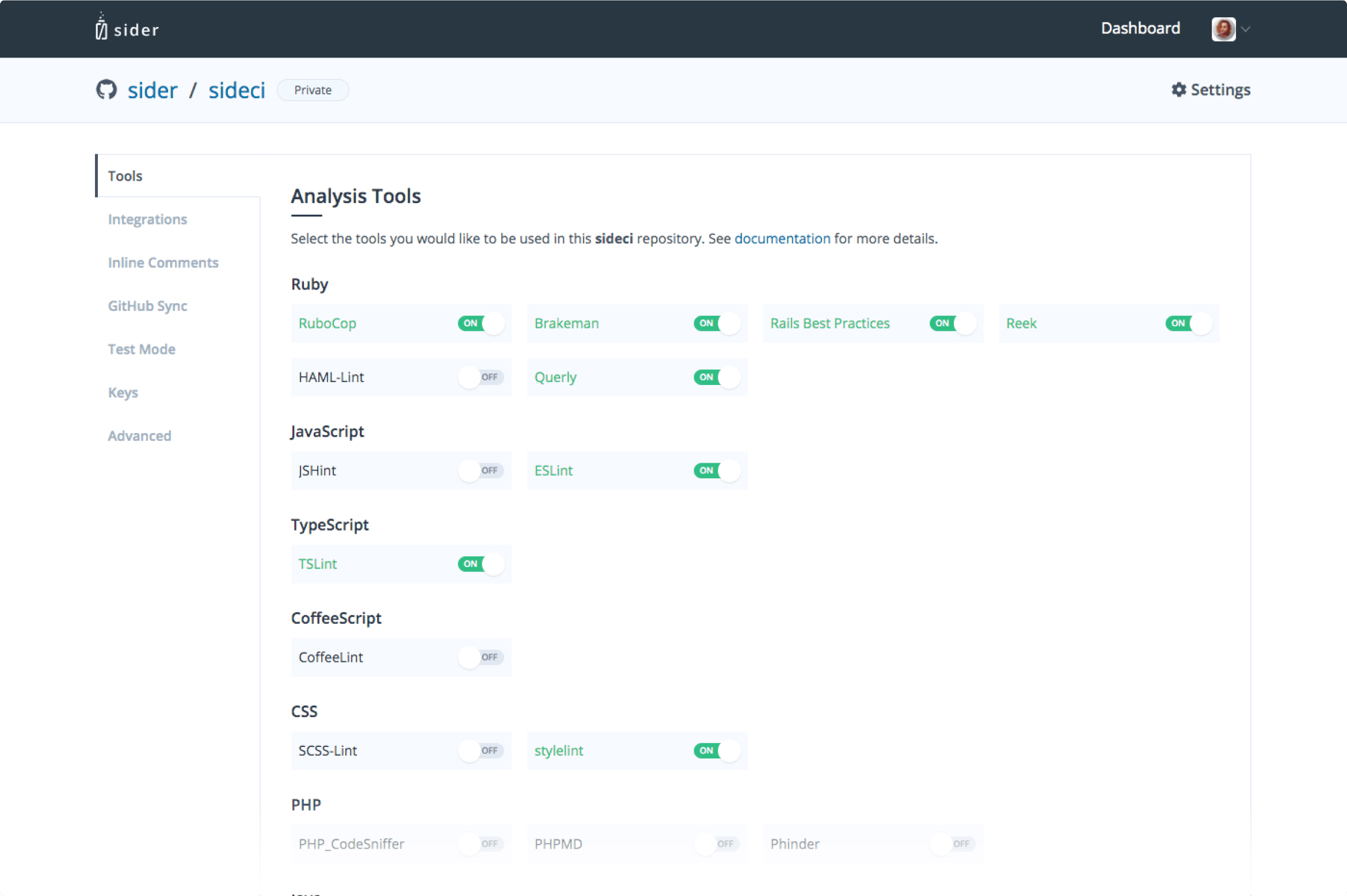
Over 90% of users landed on the repository PR view after following a check back from GitHub — making it the highest-leverage screen to improve. A second pass, annotated in the screenshot. ① Tab navigation at the repository level — Pull Requests and Settings as sibling tabs. Before this, switching from settings back to PRs meant exiting through the dashboard and drilling back down; minor friction, but a meaningless round-trip for users who stayed in-app. ② Issue state summary next to each PR status: fixed, open, and total counts inline without reading filter numbers. ③ File tree drawer open by default, with a badge per directory showing how many issues in that subtree matched active filters.
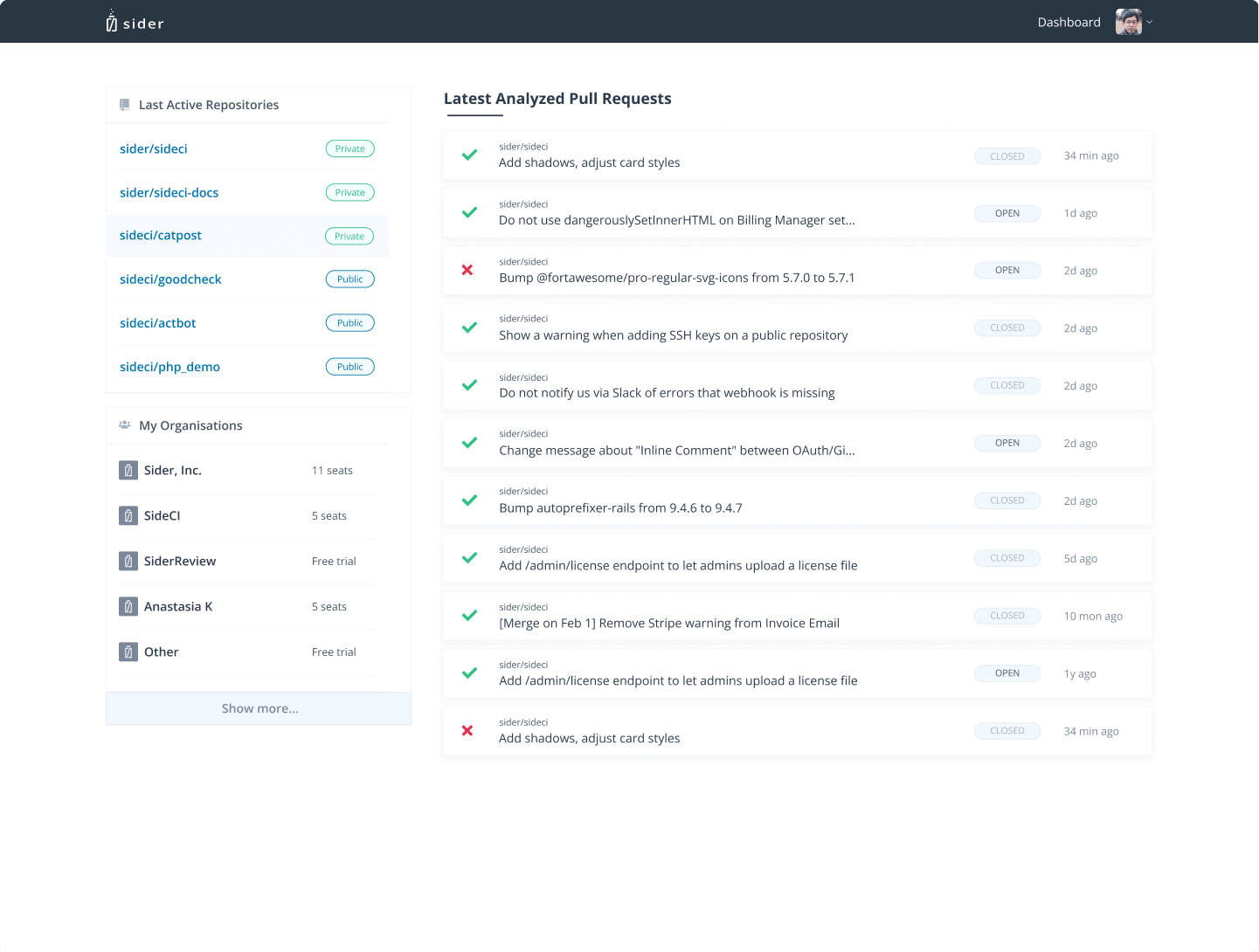
The original dashboard was a flat list of open PRs across all repos — fine at small scale, increasingly overwhelming as organisations grew. The core problem was surfacing the most relevant work without requiring users to dig. The redesign led with 6 latest repositories and active organisations, plus a compact overview of 16–20 recent pull requests. Rolled out progressively to a select cohort first — no regressions, positive signal, then full expansion.
Up next — 2020