Flora-U Mobile App
UI/UX design, Concept
2019 March (3 weeks)
- UI/UX Design
- Style Guide
- Prototype
The client is a mobile-first startup that lets anyone have flowers, and bouquets delivered to anyone within an hour. By creating a seamless in-app experience similar to services like Postmates and Uber, they hope to continue to scale and expand by the end of the year.
The users are consumers and local florists. Consumers are a wide range of people from 20s to 50s who are comfortable ordering products online, they will on average use the app 1-3 times a year. The delivery process must be transparent to ease their anxieties.
Role and approach
This project was a part of a bootcamp and had to be completed within three weeks. I was in charge of market research, surveys, user interviews and rounds of user testing. Using the acquired information I could then transfer what I learned into the UI design for the high-fidelity prototype and UI styleguide for further use.
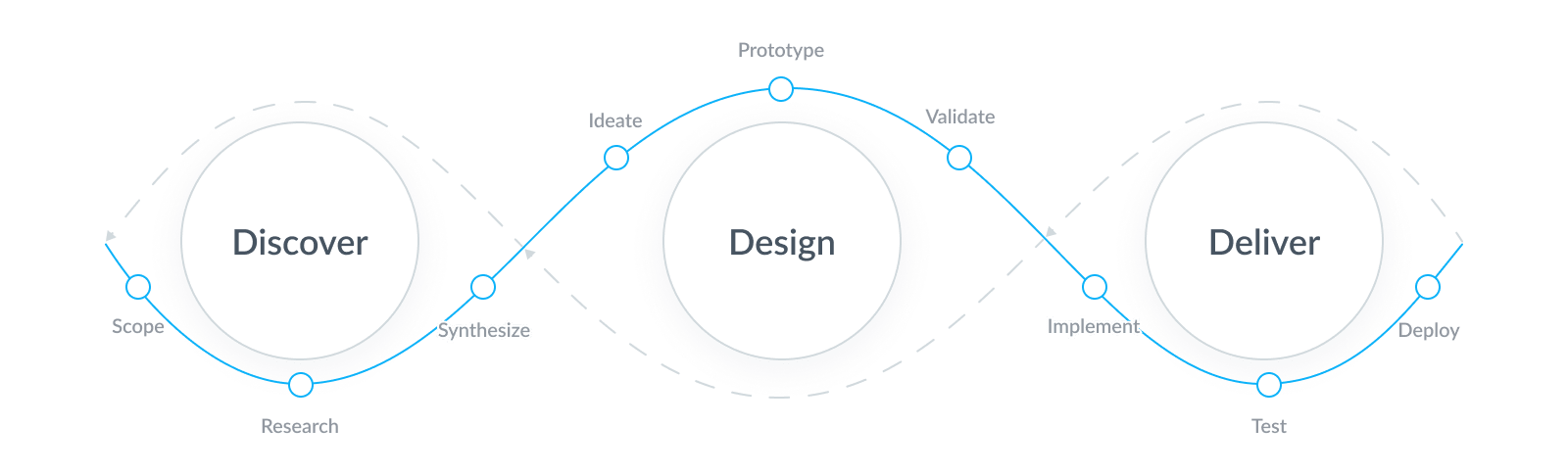
design thinking]design-thinking

Discover
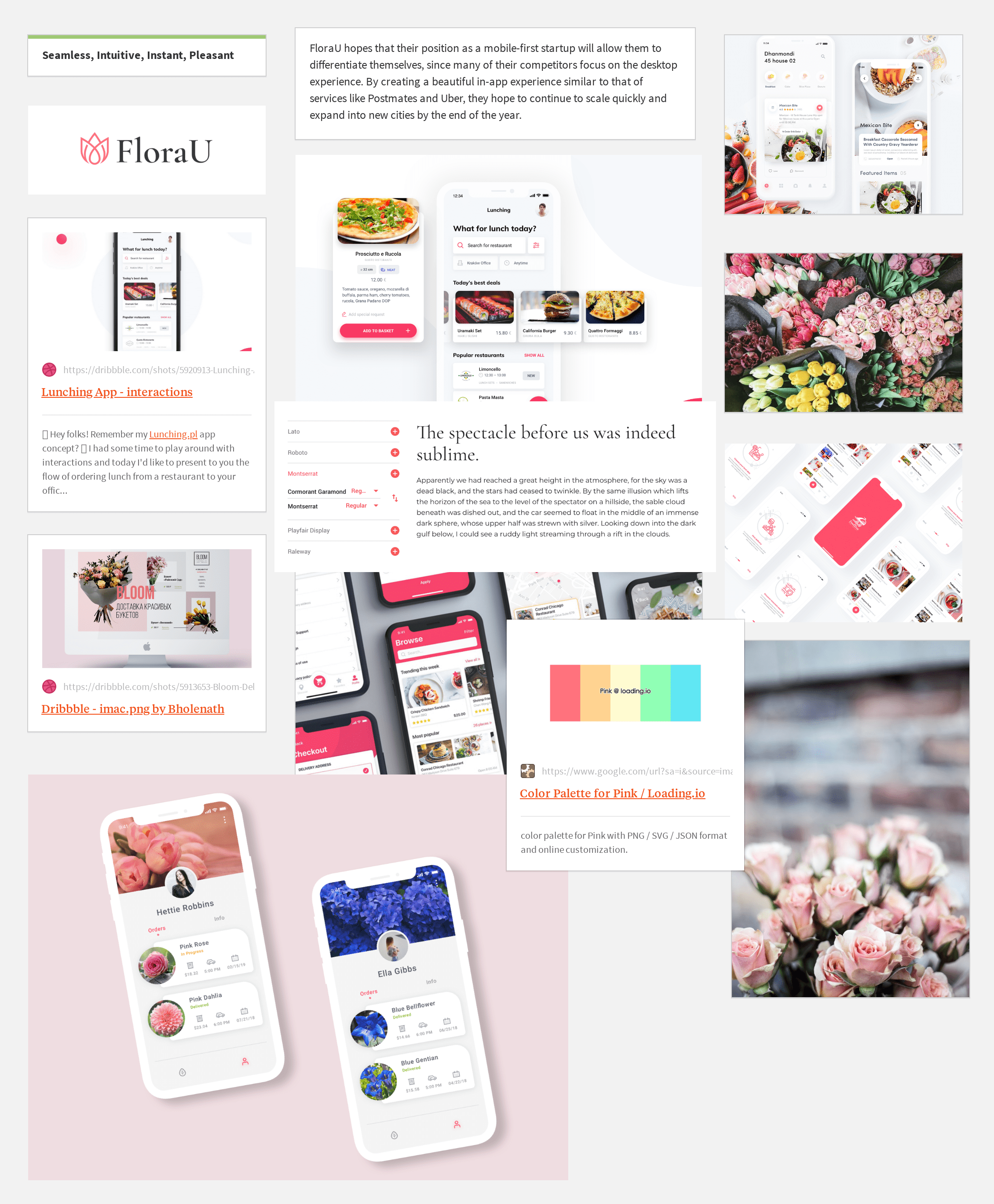
The discovery phase started with comprehensive competitive research and running a survey of 25 participants via UsabilityHub to identify common user struggles and needs. Based on that data, 2 primary personas and their use cases were crafted, followed by functionality ideation and moodboarding.
Common user struggles:
- Worrying whether the items will arrive on time
- Can’t search by budget
- Too many options
Common user motivators:
- An easy way to see a large number of options and to filter through them
- Easy customization with all options right in front of the user
- Speedy and more convenient than going to a store
Have used the competitor services before:
69% used 1-800-Flowers
Usage frequency:
52% order flowers online 1-3 times a year
Other on-demand delivery app usage:
- 46% UberEats (Mobile-first)
- 15% Postmates
- 62% DoorDash
- 69% Grubhub
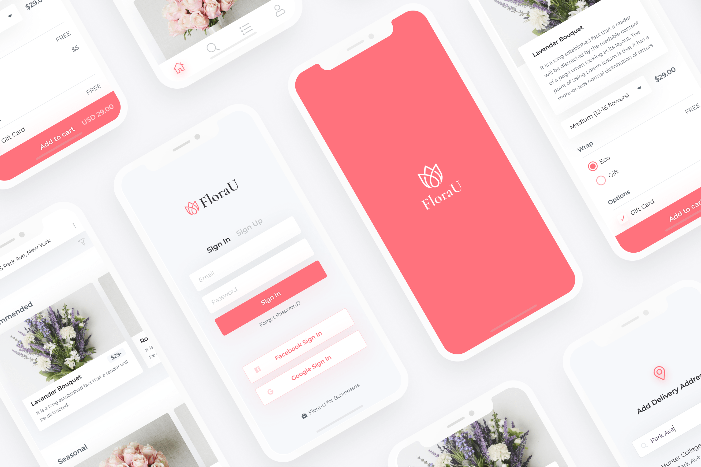
Design
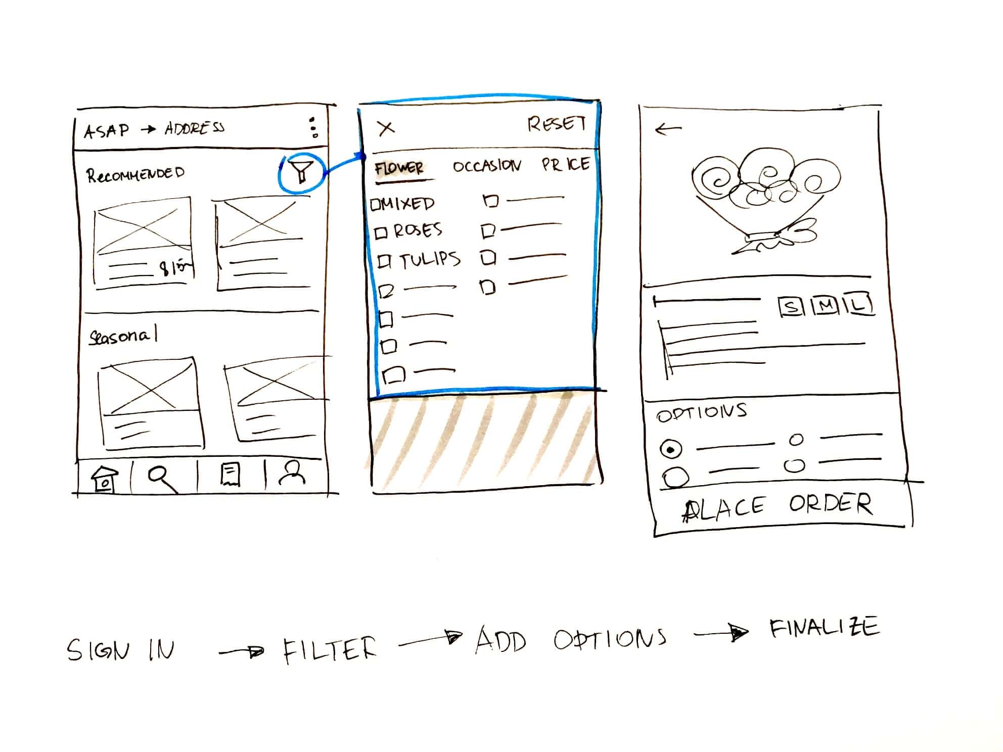
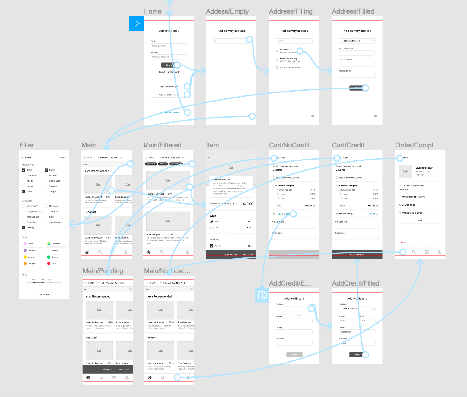
Based on the personas created, the use cases, as well as project constraints and stakeholder wishes, I have created 3 task flows for both the consumer and the floral businesses. Once the task flows were ready I created wireframes of 24 screens to support primary user goals, before testing them with 3 users and further refining designs based on the results.

Usability test objectives:
- Confirm whether the project functionality constraints are met.
- Uncover potential usability problems.
User quote:
"I feel uneasy about inputting my credit card details into a new app, especially before I have seen what I’m going to be paying for."
Problems and Solutions:
- ⅓ on business flow side said they would be too busy to manually change order status multiple times.
Once the order is claimed, instead of a dropdown have one button to “CONFIRM FLOWERS READY”, that way once the bouquet is done, all the florist has to do is to press one button. - ⅔ did not like the initial new user flow that was asking for credit card details before starting to shop.
Move the credit card prompt to when the user is checking out instead, as well as enable the addition of credit card later through “My account” settings.
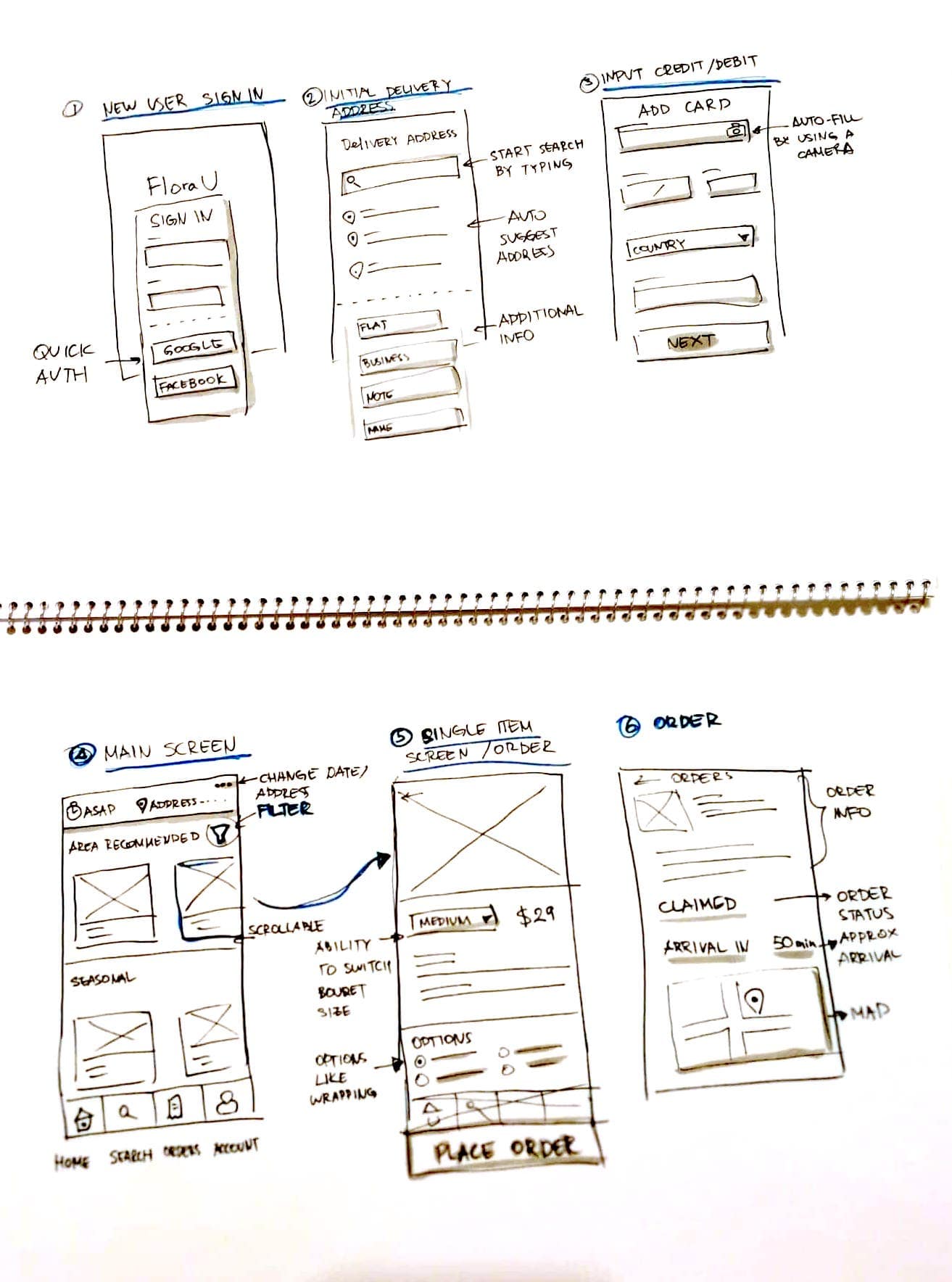
Initial Sketches
Low-Fi wireframes and proto

Deliver
The deliverables for this project were UI style guide and a high-fidelity prototype. The color scheme was decided to have only one main color and be grey-based to make it adaptable to any content. Once the elements were designed based on usability best practices, a high-fidelity prototype was created. Running another user test with 2 participants uncovered new issues that were improved, as you can check from the following prototype.
Final Thoughts
It can be very beneficial to run quantitative research in the earlier stages of concept development, it can give you a solid understanding of who the users are going to be and what they expect.
When using surveys, structuring open-ended questions properly can help you also get insightful qualitative data.
Just because a certain user flow is used in one of the top products, doesn’t mean that users necessarily like it or that it will work well within your product.
Next Steps
One of the major parts for the next iterations is creating and testing a driver’s experience, how will they be notified and what should their experience on the app be?
Creating a working prototype according to specs and testing it in the real environment by both observing and interviewing users is crucial as it will show how all parts work together and what might need further rethinking.