Sider Web App
UI/UX design, Front-end development
2017-2019
- Prototypes
- UI/UX design
- Front-end (React, SCSS)
Role and project
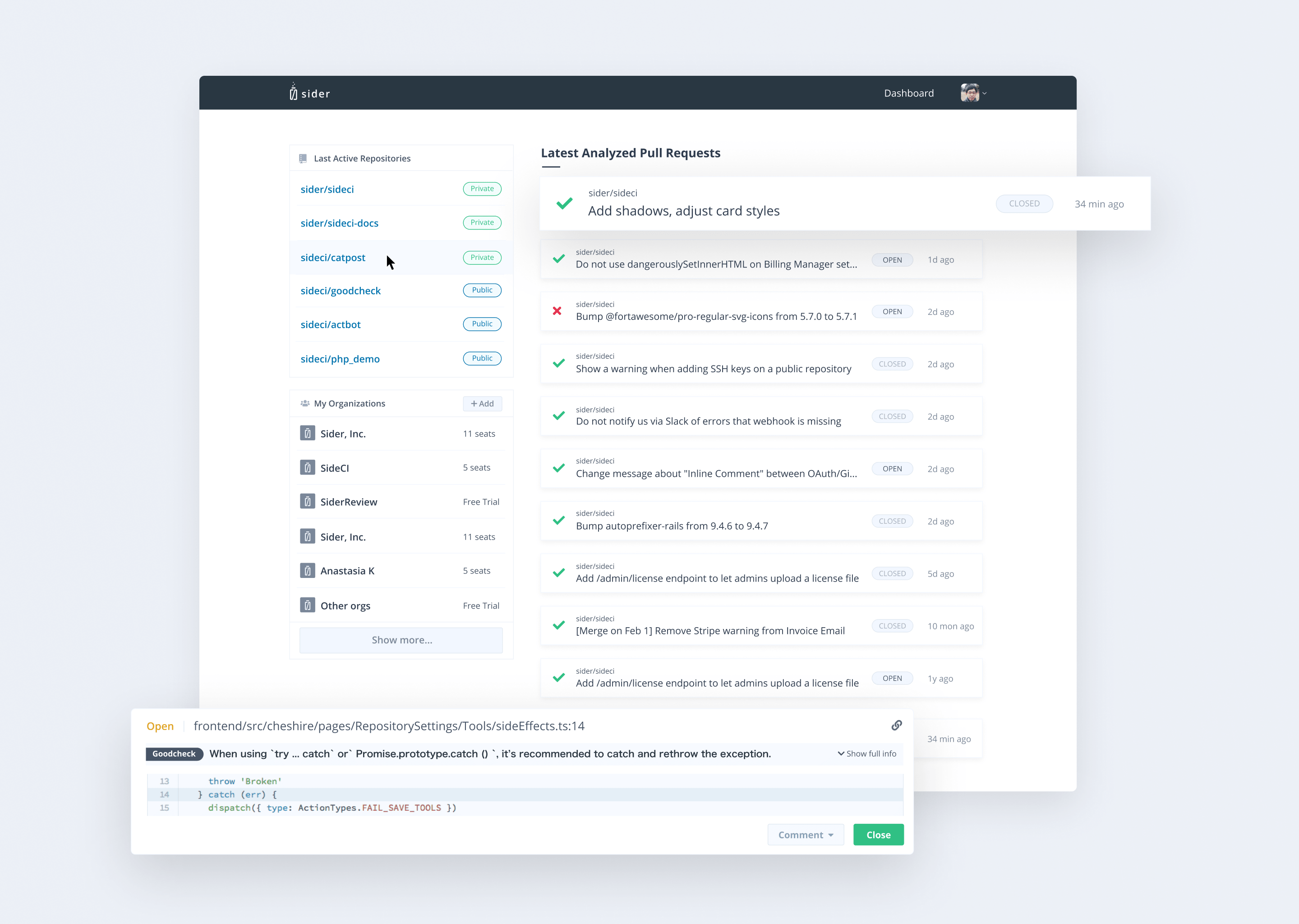
Sider is a static code analysis SaaS for GitHub pull requests with the mission to simplify developers’ lives by automating code review. I have been a full-time designer and front-end developer working along with a team of 5 developers and other departments since December of 2017. My role included design, some front-end coding (React, SASS), and maintenance of their web application, with one round of total app redesign and development of at least 5 new features, as well as the constant iteration of existing features, user flows, and visual design
Dashboard
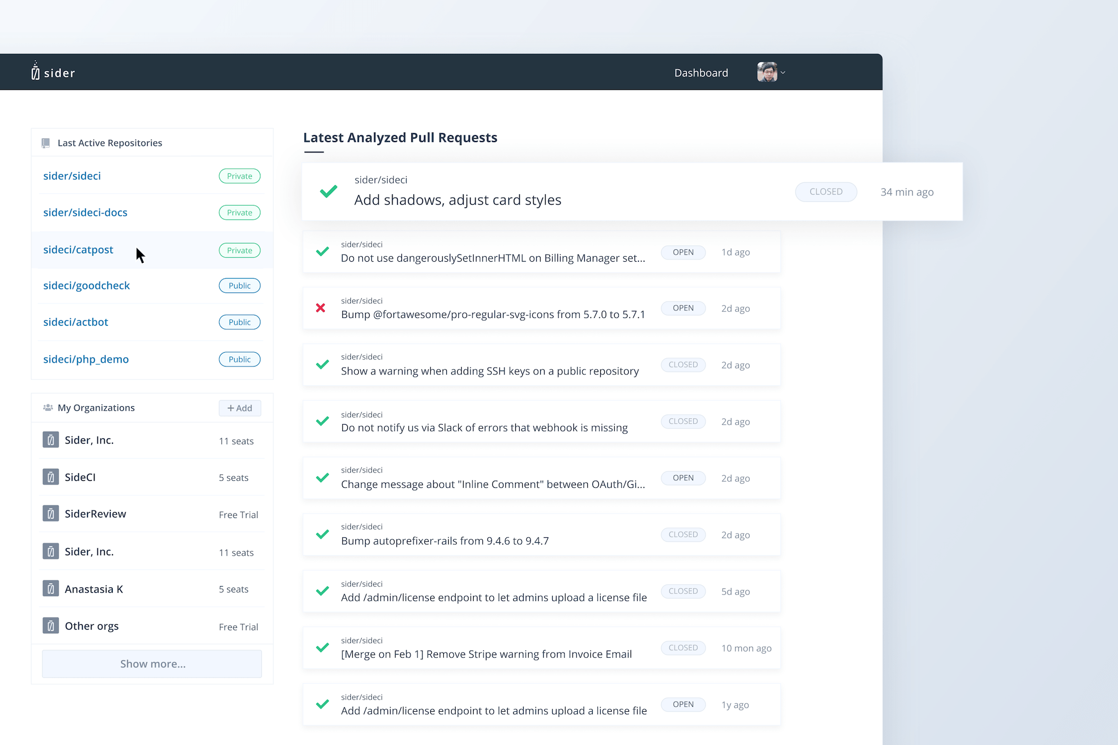
Problem: Users did not have an easy overview of the latest relevant information.
Solution: Creating a dashboard with immediate access to all of the relevant parts of the application.
Ideation/Design: After gathering user feedback and ideating with the team, the contents were decided to be: the 6 last active repositories, all organizations (seeing that majority of users will only have 1-5 organizations they belong to), with the default view allowing a maximum of 6 and ability to load more when needed, and 16-20 latest pull request with a compact overview of Sider status, GitHub status, contents and time created
Results: The feature was released to a select number of customers, and all the relevant feedback and screen captures were gathered, once small bugs and UX problems were fixed, it was released to all users.
Issue filtering
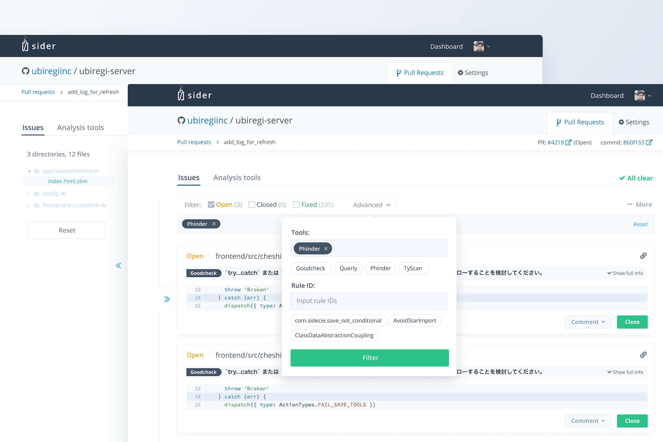
Problem: Users experiences difficulty scrolling through the long list of issues, unable to efficiently find and close specific types of code issues.
Solution: Creating a simple-to-use filter UI, that would allow users to search for specific code issues.
Ideation: First I created several sketches of different types of filtration we could use in our product, after short in-house user-testing and collecting team’s feedback, the general pattern was decided on. In the rounds of testing, a need for a secondary tree-type navigation system appeared, the idea was tested and proved to be efficient, leading to the next design step.
Design: After making sure the visual design complied with the existing style guide and pattern library, I have created a working prototype in Figma. The prototype was then used by the team and the feedback was collected. I then made further necessary visual and functional tweaks to ensure better technical feasibility and faster development.
Results: Testing the functionality with the real users and seeing them interact with the feature proved that the criteria were met. The feature was then adjusted and iterated even further based on the feedback and inquiries.
Complete UI redesign
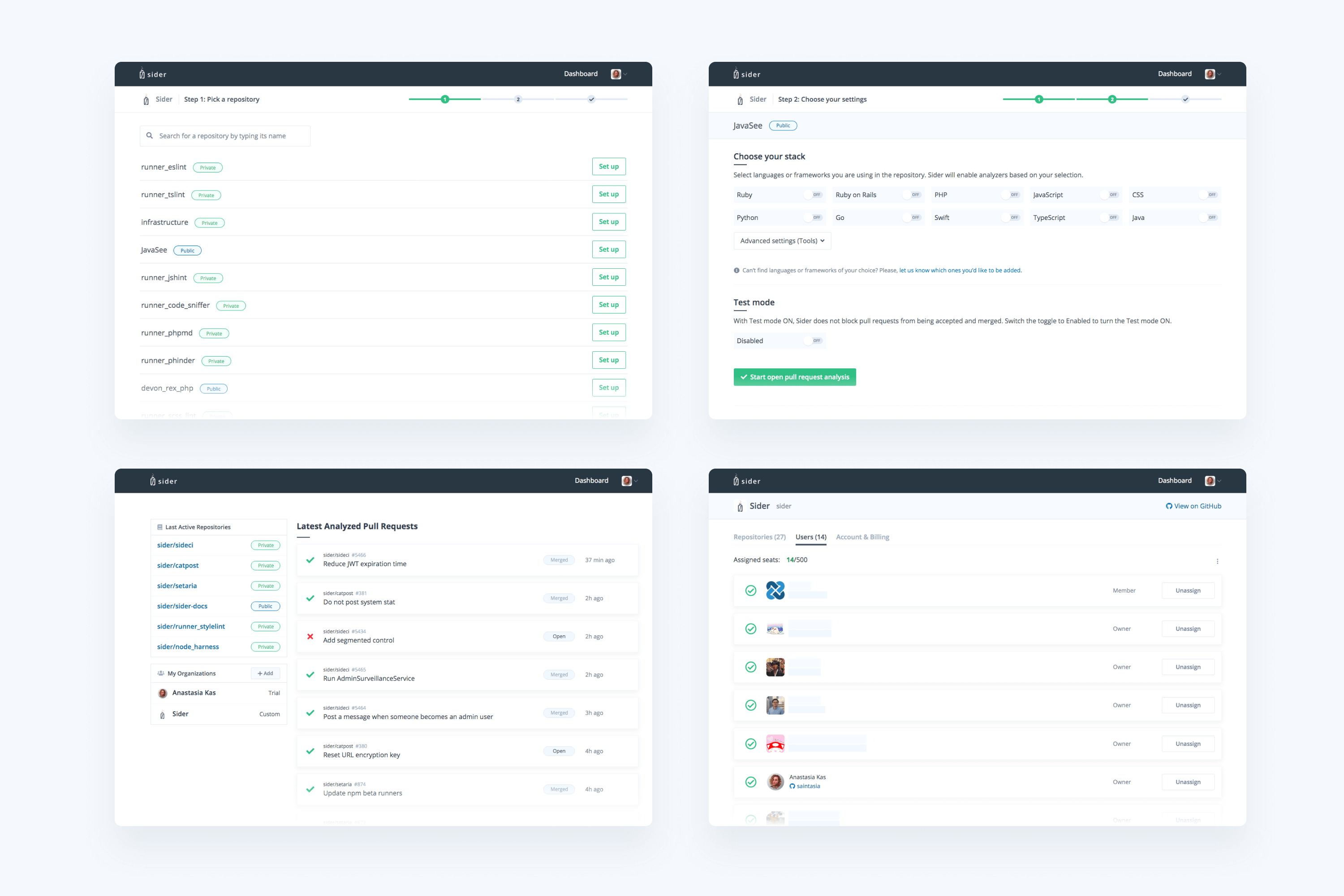
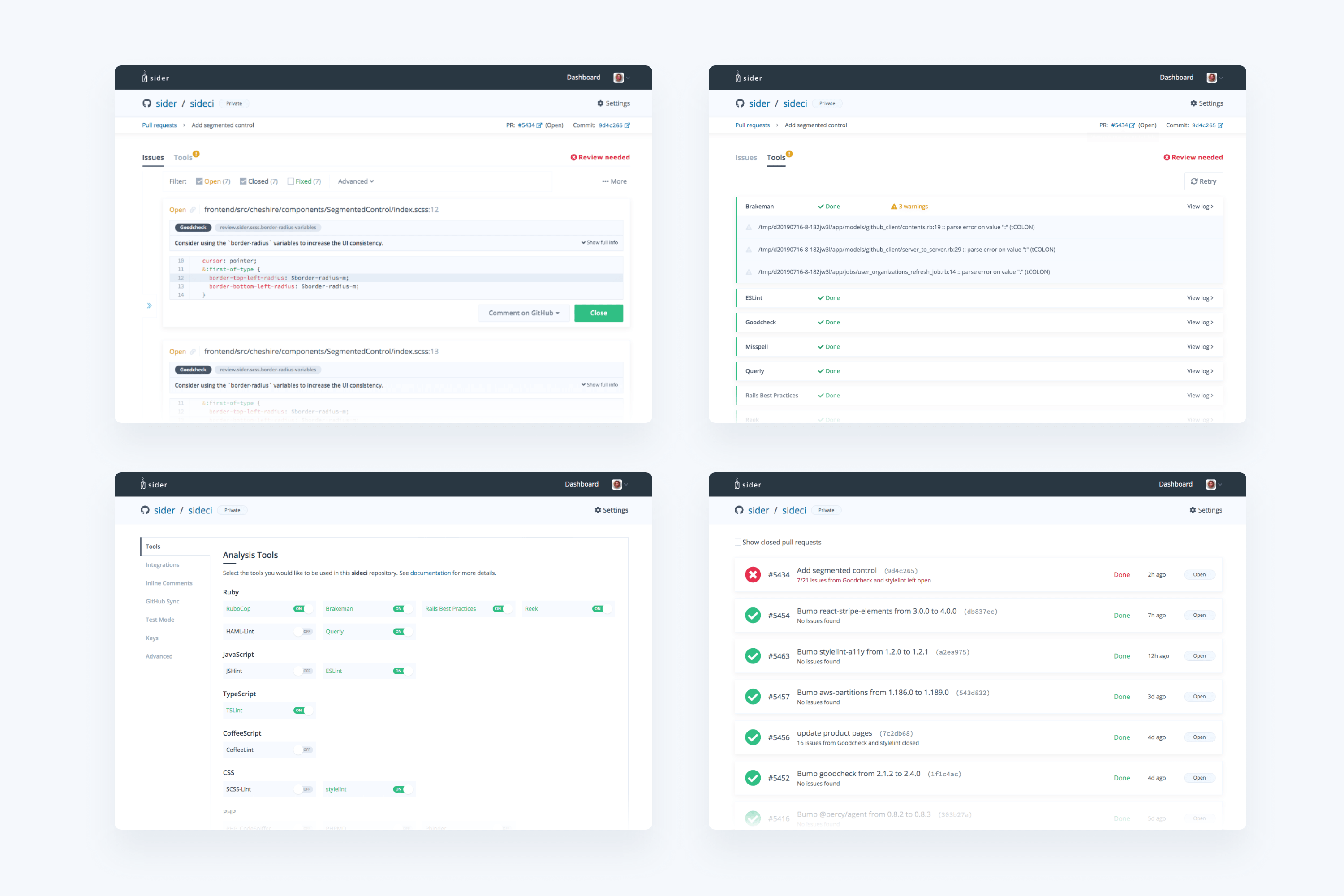
Over a year and a half, I completely redesigned the old system, designing over 60 pages and their states, working prototypes as well as running some usability testing for both existing features and those in the making.