Project Management Web App
UI/UX design, Concept
2019 February (3 weeks)
- UI/UX Design
- Style Guide
- Prototype
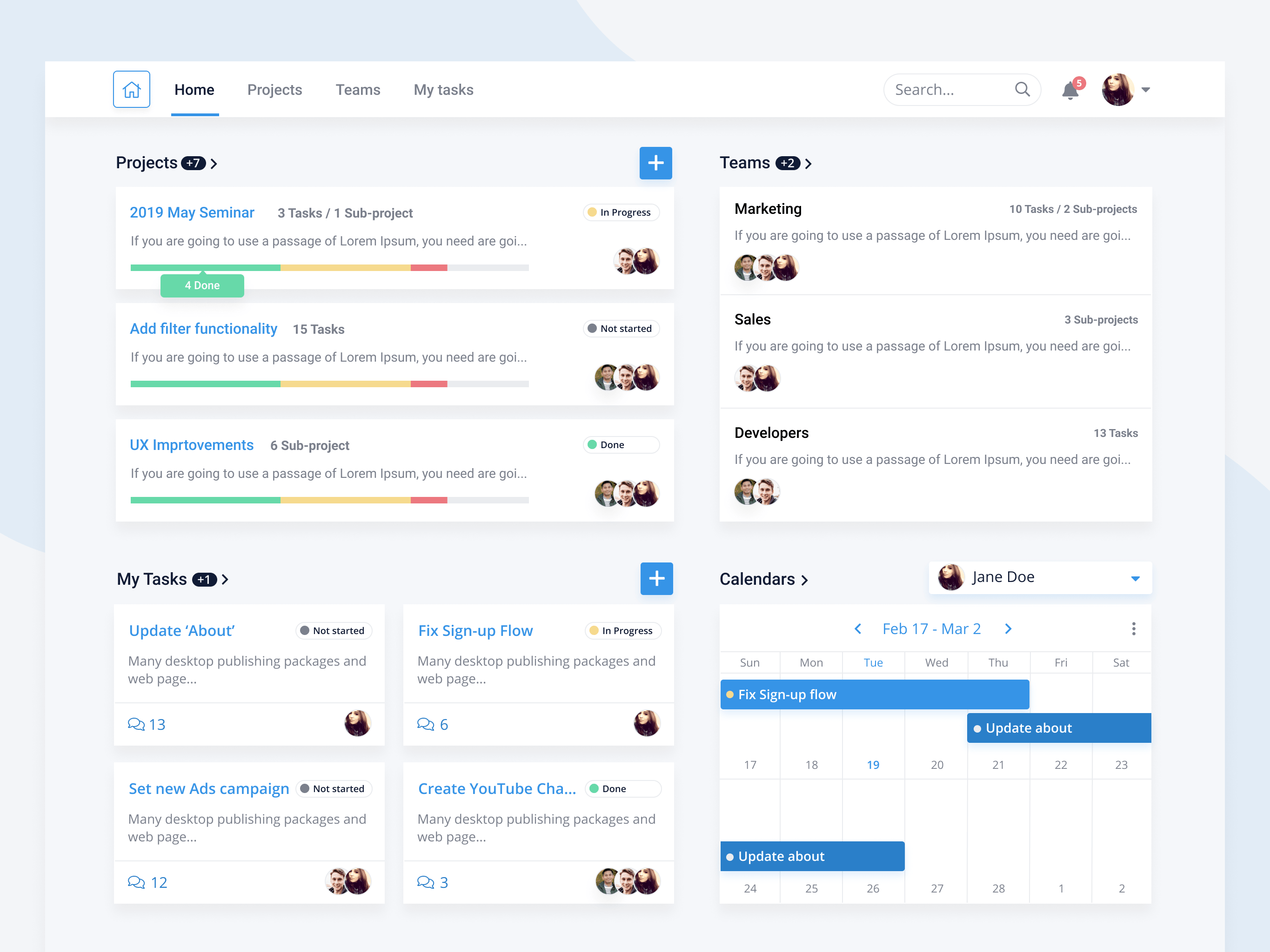
The client is a B2B company providing enterprise-level software. They’re looking to create a free project management tool for the web which will help them attract start-ups and small businesses, who in turn can be potentially converted into their legacy product customers.
The users are start-up owners and employees ages 20-40, who are struggling with overly complicated task creation processes many PM tools are guilty of. They want a transparent intuitive experience for tracking projects and tasks.
Role and approach
This project was a part of bootcamp, and I had three weeks to complete all phases of the design thinking approach. I was working alone, doing consumer and market research, user interviews and rounds of user testing, as well as visual design for UI and final MVP high-fidelity prototype.

Discover
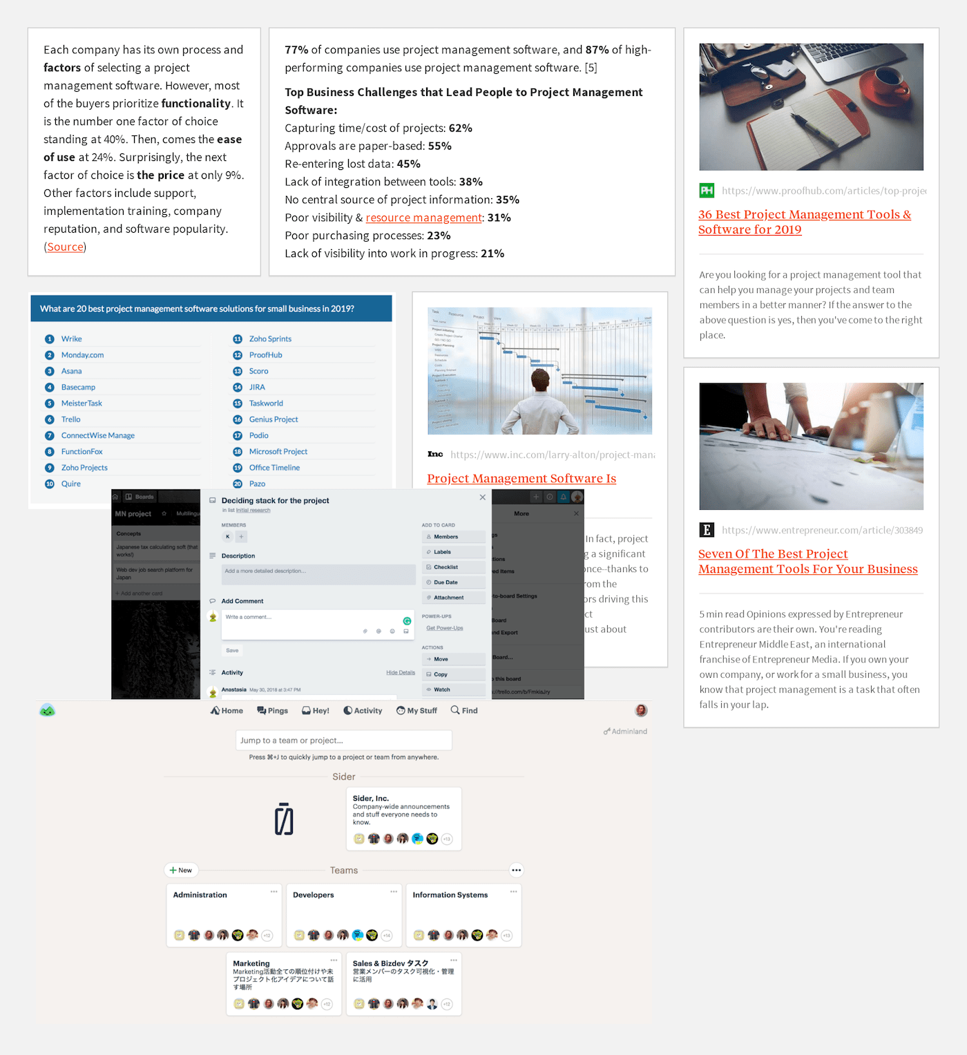
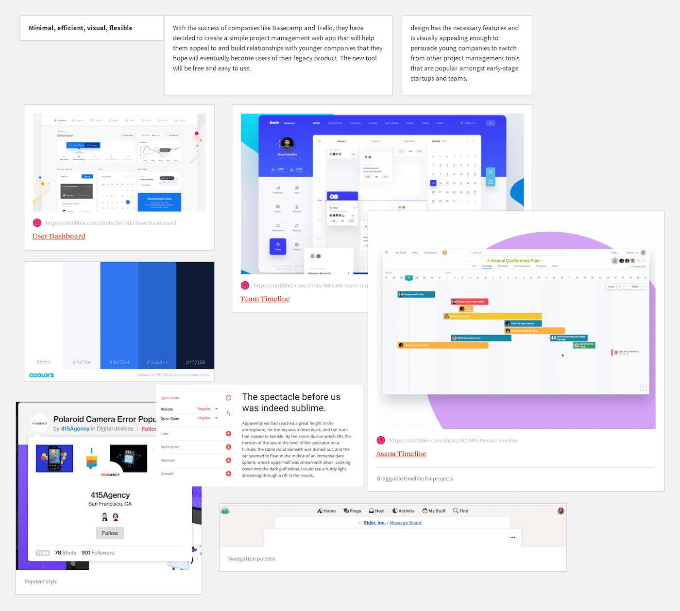
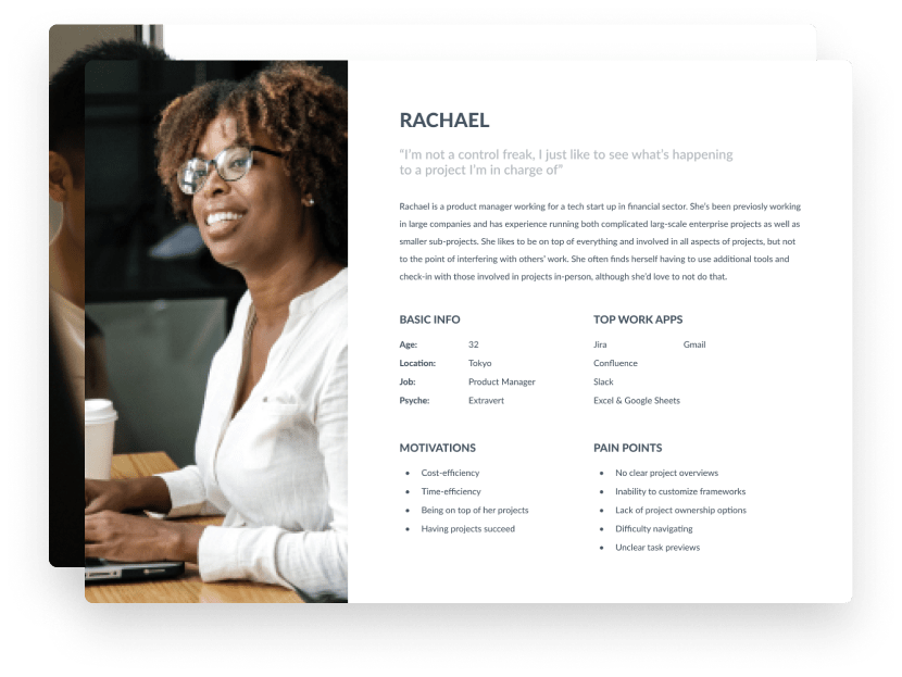
I started the discovery phase of the project by going through the project constraints and needs, running market and consumer research, as well as implementing qualitative techniques and interviewing 4 potential users. Based on the data gathered, I could synthesize 2 primary personas, 5 use cases, moodboards and initial functionality ideas.
"The common complaints among all participants included overly complicated task creation processes, lack of task statuses, poor information architecture, and difficulty navigating. Everyone enjoyed or would like having a clear overview and timeline, visually easy way to see what’s happening, and flexibility to adapt projects to their needs. The majority also voiced frustration when it came to integration of other services, as many tools seemed to lack these options or not support them well enough."
Several picked up use cases:
- When I get a technical complaint, I want to create and assign the task quickly, so that someone on the development team can reply to me as soon as possible.
- When I get asked a question about new features or an update, I want to quickly check the project’s status, so that I can give customers an accurate estimate.
- When I get asked whether a certain problem has been addressed yet, I want to see the task status, so that I can give an accurate response to customers.
Design
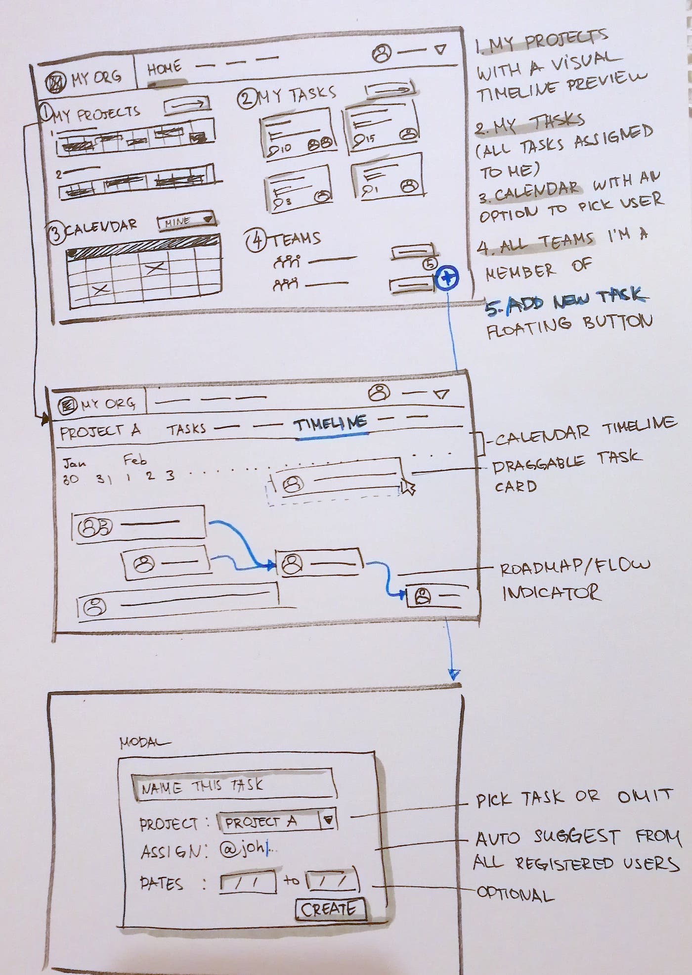
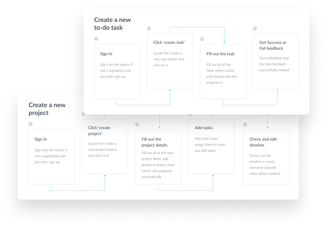
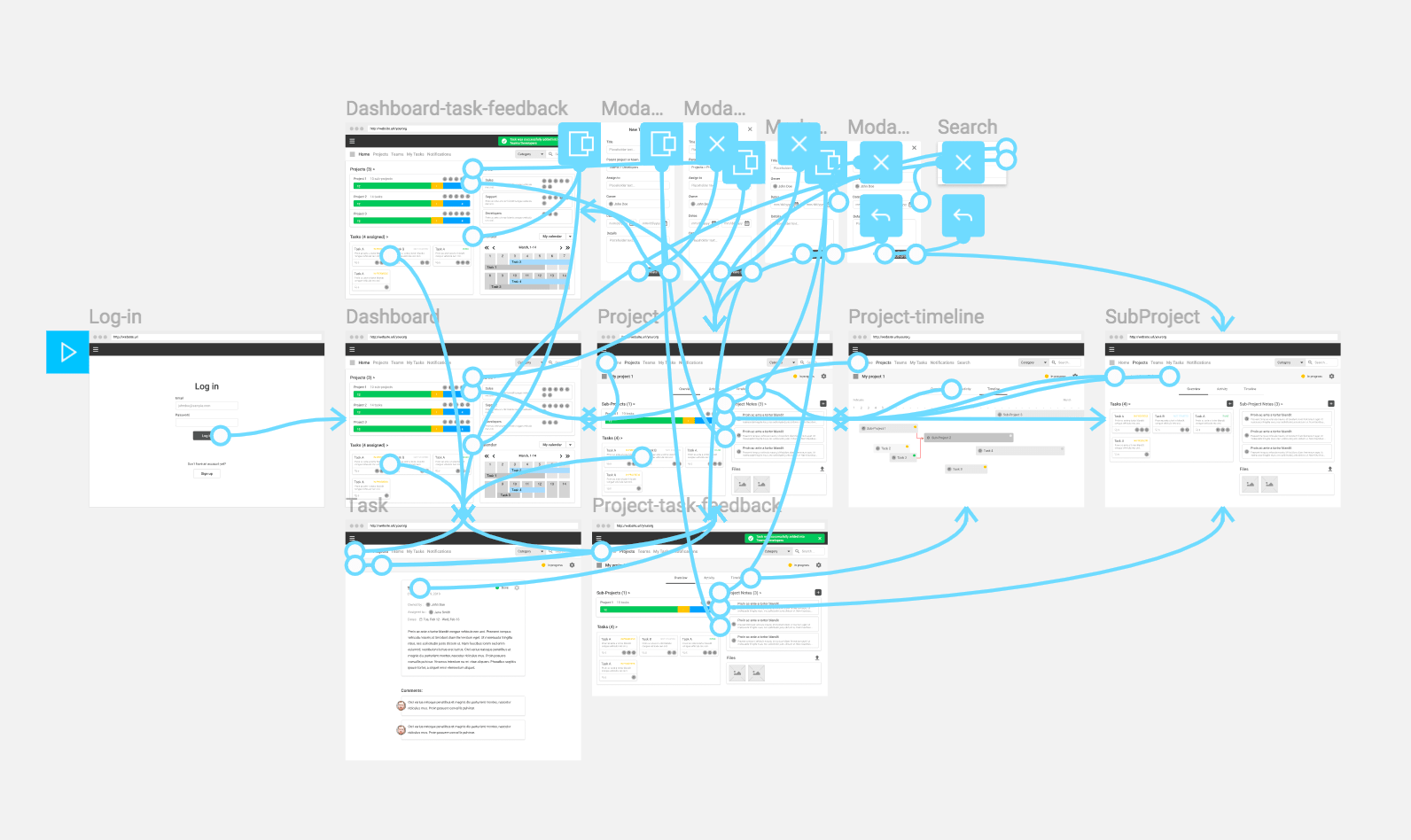
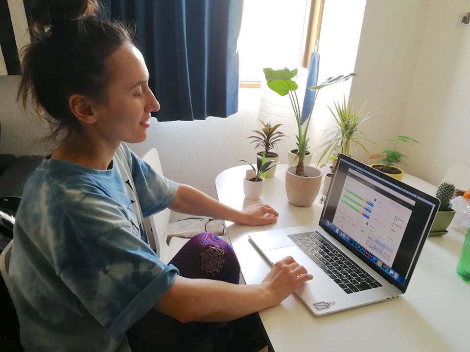
Based on the interviewees’ feedbacks, use cases of our personas and client requirements, I then created 4 task flows that helped me define the main functionality I needed for the initial wireframes and prototype. Once the prototype was ready, it was tested out by 3 users and refined based on their feedback. The refined solutions were then tested again until users were satisfied.
Usability test objectives:
- Identify if the product features would be useful for users.
- Identify if the main tasks are easy to accomplish.
User quote:
"It took me a while to understand what “Place this task under” field is for, I understand it now but I had to make a pause...There should be a better wording for that."
Problems and Solutions:
- ⅔ were confused with ‘Place this task under’ in a task creation modal.
The copy was changed to “Parent project or team” and tested again, this solution made it more intuitive for the users.
- ⅓ were confused with what ‘Message board’ in Projects would contain.
As different tools use different naming conventions, the word ‘Messages’ could be associated with notifications as well as direct messages. The copy was changed to “Notes” and tested by the users with a positive outcome.
Low-Fi wireframes and proto
User Testing
Deliver
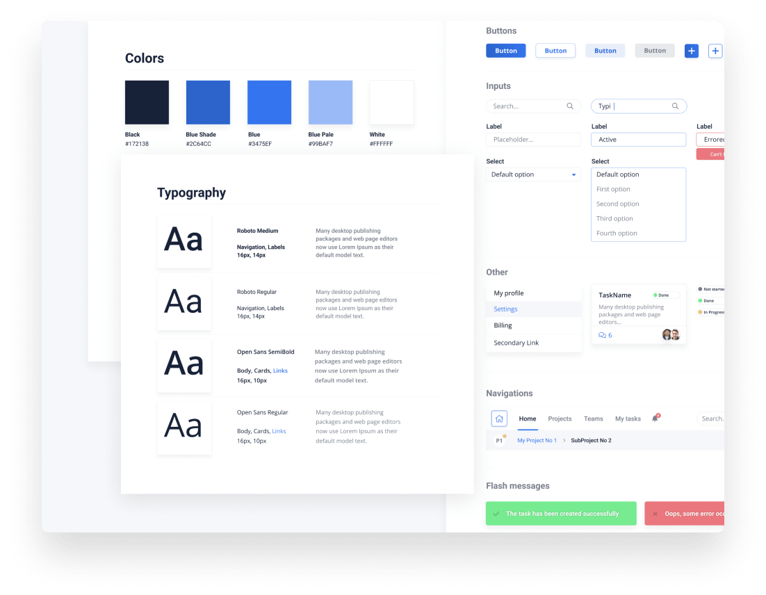
The deliverables included UI style guide and a high-fidelity prototype. Once the color scheme and typography were in place, the elements were put together and a prototype supporting main user flows was created. To uncover any inconsistencies and usability flows before moving onto the next step, another round of user testing with 2 users as well as A/B testing was held. Based on the findings, more tweaks were made to the prototype that you can click through below.
Final Thoughts
Copy, terminology, and text in your designs are just as important as visual elements and should be treated and tested as such
Users carry their mental models from other applications and it can be difficult for them to abandon them even if they may not be the best to refer to, you should always try and find the middle ground for such cases
Even if sometimes users seem to give feedbacks that conflicts other testers, with careful consideration you can always find common denominators that you can focus and improve on.
