Sider Website
Web design, Front-end Development
2017-2019
- Design direction
- Web design
- Front-end (slim, JavaScript, SCSS)
Role and project
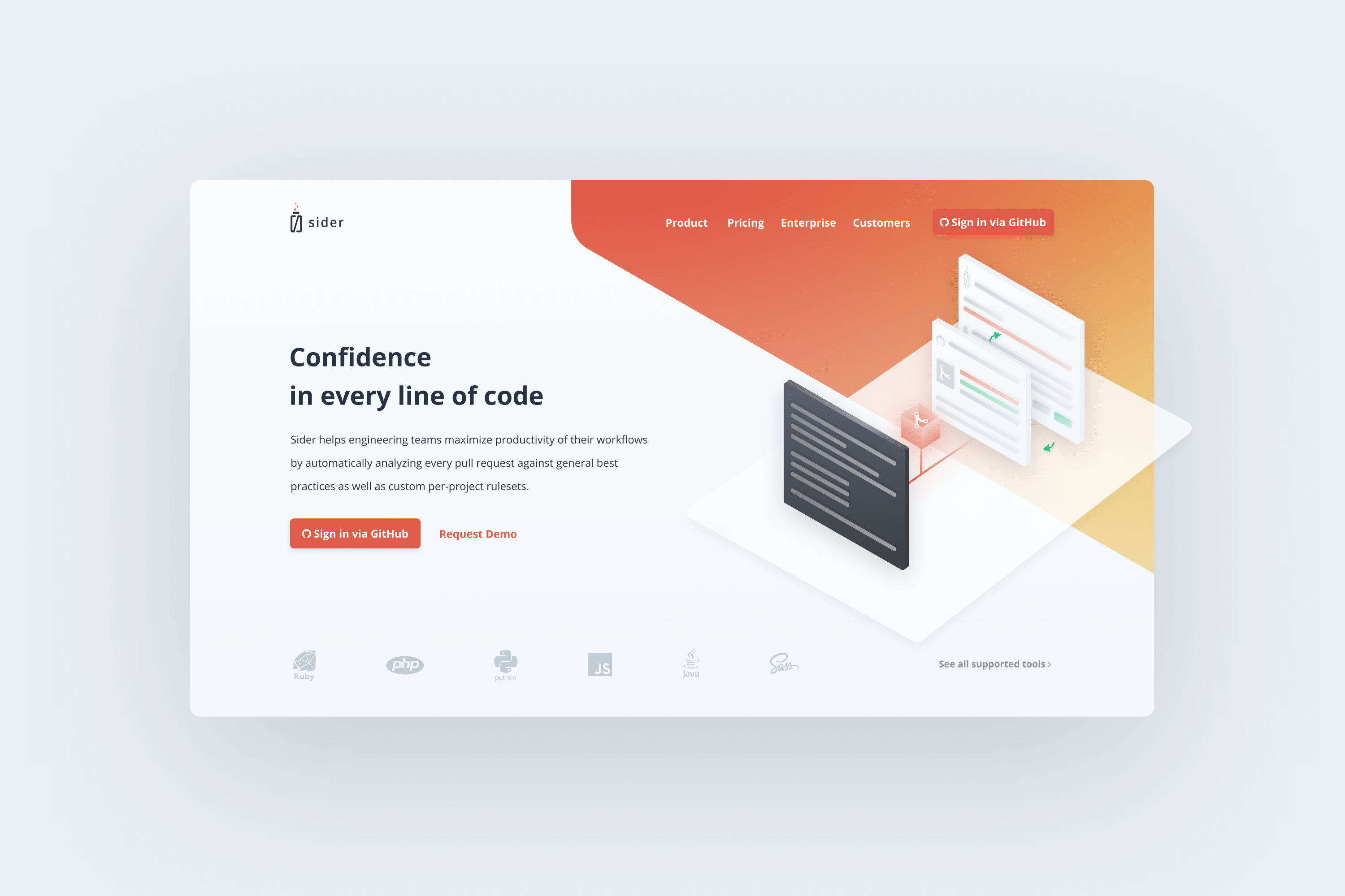
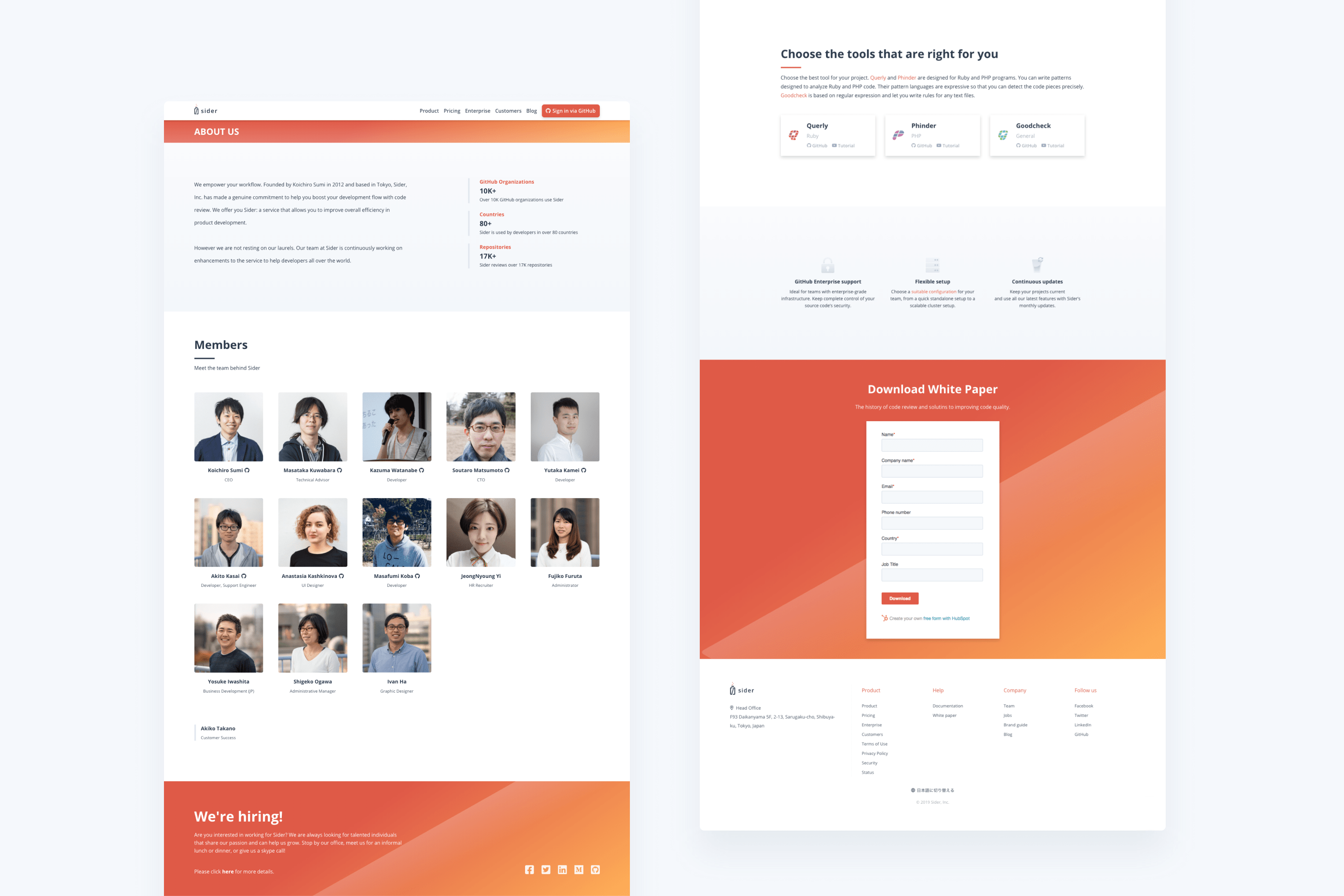
Sider is a static code analysis SaaS for GitHub pull requests with the mission to simplify developers’ lives by automating code review. I have been a full-time designer and front-end developer working along with a team of 5 developers and other departments since December of 2017. My role included design, code, and maintenance of their main website, with at least 4 rounds of iteration based on customer feedback and analytics.
Rebranding
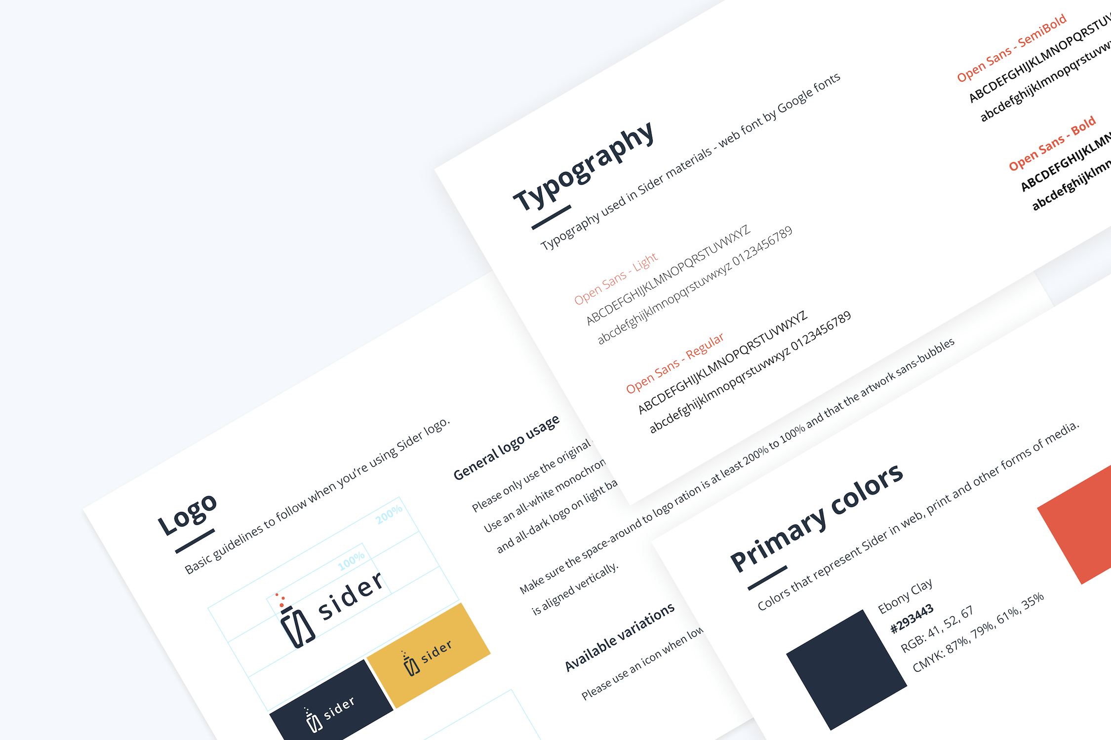 In spring 2018, the decision was made to rename and rebrand the company, my role was to lead the rebranding process. This included participating in company and product renaming (SideCI to Sider), market research, new identity and logo creation.
The new branding was to be different from the existing competitors, with a strong message of friendliness and ease of use. After thorough competitor research, I created a branding scheme and launched the logo contest that I monitored and led. Once the main aspects of branding were decided, I created a more comprehensive brand guide.
Redesign
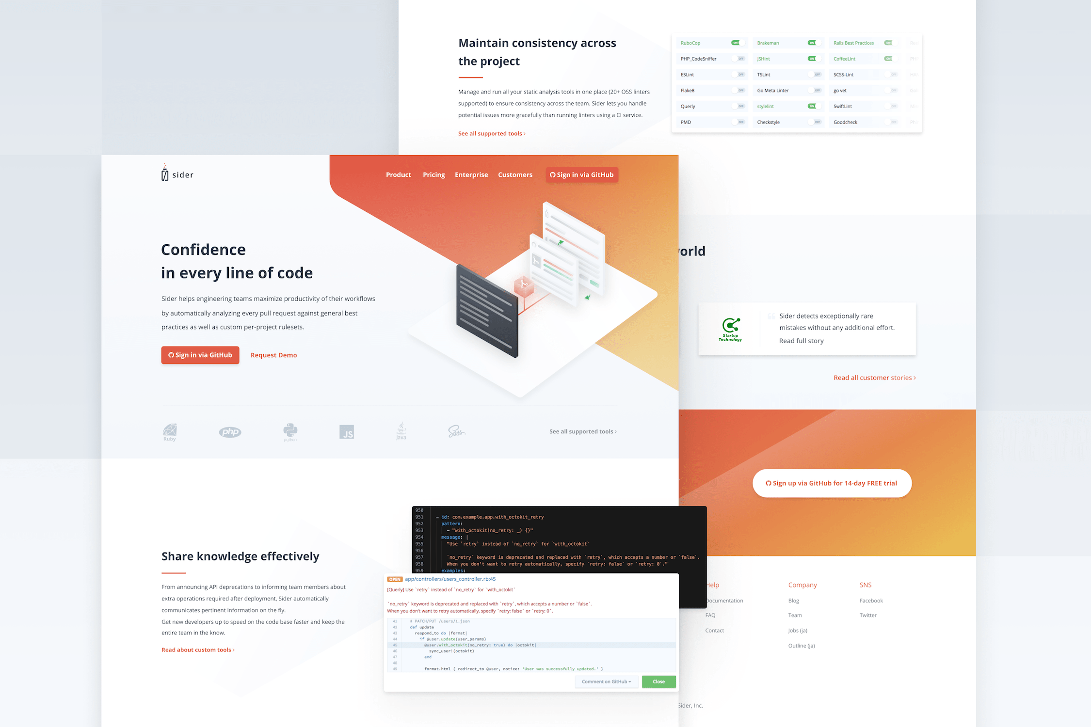
I was also in charge of several rounds of Sider’s website redesign, as the product was constantly changing and evolving, the tone and contents on the site itself had to reflect those changes. Based on user feedback collected by the members of our team, we could craft better content and, as a result, I could update the design to support that content.
Development
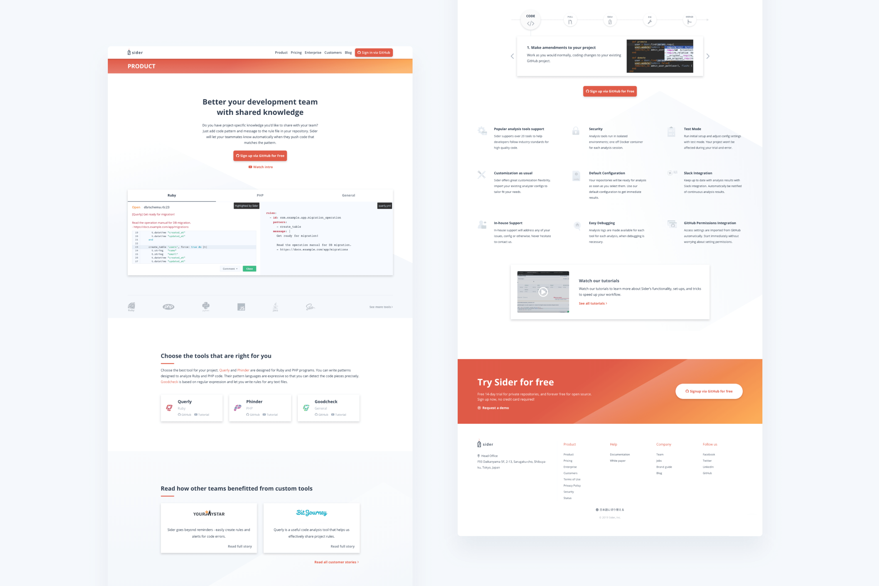
I was in charge of the website development as well, working alone on front-end with some support from back-end developers. The coding was done without any frameworks or static site generators in slim, vanilla JavaScript and SASS. Custom queries, mixins, flexbox, and grid for the responsive layout, that I adjusted in code rather than in a design program. SVG images, and responsive image handling was used where possible to ensure fast loading speed.
Optimization
By creating a better mobile experience and clearer copy and structure, over the time I worked in Sider, it was possible to triple session duration among new users from 30sec to 1min 30sec on mobile and decrease the new mobile user bounce rate from over 70% to 52%.
I also carried out a round of technical optimizations for mobile web users to decrease the weight of the page, which resulted in an overall bounce rate among mobile users decreasing from 82% to below 70%.
To achieve better loading speed, a combination of approaches were used including utilizing an image-optimization package, combining javascript source files and using media queries in images to let the browser decide the best-fitting size. This resulted in a performance boost and an increase of PageSpeed Insights mobile and desktop score by over 20%.