Sesimi App
UX Engineer
2020-current
- UX design (Figma,GA,Smartlook)
- Front-end Engineering (React, Typescript, Tailwind)
- UI library

Role and project
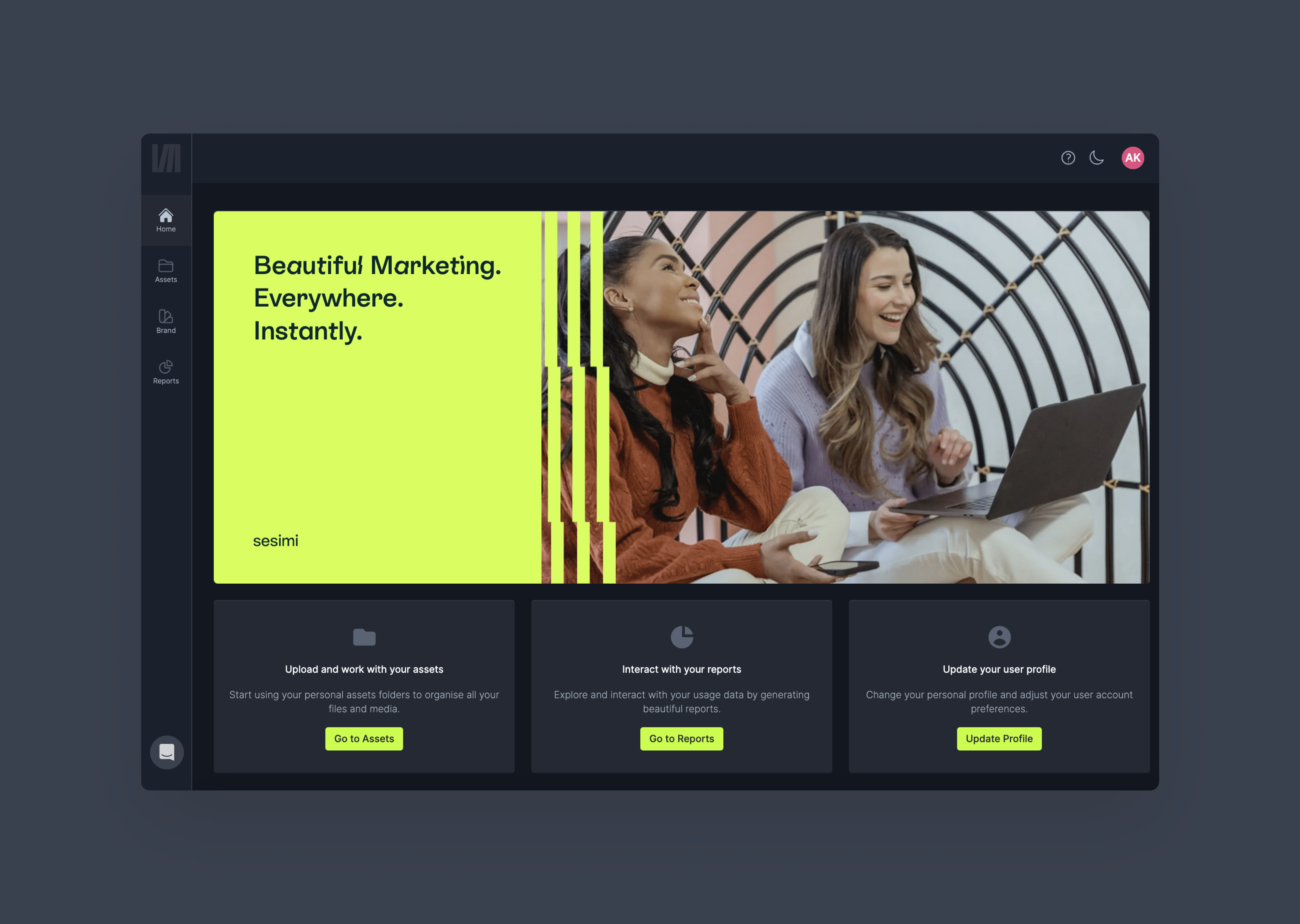
Sesimi is an asset management system empowered by hyper-flexible templates. It's utilized to assist businesses worldwide in producing advertisements that strictly adhere to branding guidelines, while also offering the flexibility to produce multiple variations, formats, and sizes (responsiveness). I have been serving as a UX Engineer (part of the product team) for 3 years, dividing my time between improving and creating user flows (including user research) and front-end engineering. Below are examples of some of the problems, solutions, and methods used in several features within the main application that I played a role in resolving.
Template Export
Problems: The build and export tabs were separated, making it difficult for users to seamlessly download their assets. Additionally, the media pack was taking up substantial space in the sidebar and was getting lost in the content.
Process: The confusion between the build and export tabs was identified during pre-release usability testing, where multiple users struggled to seamlessly export their assets.
A swift iteration of the pattern was implemented, merging the functionalities in the UI, and a repeated round of user testing confirmed that no tested users experienced problems navigating the export functionality at that point.
Regarding the tray, user feedback from surveys and telemetry tools, such as Hotjar, as well as user interviews and ideation sessions with the entire team, indicated that people were struggling to grasp the concept behind "pack." Moreover, moving the "pack" out of the sidebar eliminated its visual representation as a "pack."
After some brainstorming and quick surveys via Intercom, we decided to rename the functionality to "tray" and added tray-related actions to the consistently visible area of the export page, thus creating a constant element.
Initially, the default action was set to "Download tray" if the tray contained any items (iterations of the assets). However, since when the tray is empty, the default functionality was to download the visible asset, this approach confused a significant portion of the users. Another iteration was to maintain the default behavior and place all the "extra" functionality into the dropdown.
Solutions: We merged the "Download" and "Build" functionality into a single flow, providing a set of sticky buttons so that users can download an asset at any point in time. We renamed and moved the media pack to "Tray" and created a visual tray with thumbnails, suggesting the ability to download multiple assets at once, with sensible default actions.
Results: The improvements have been released, and inquiries to the Customer Service (CS) team have dropped significantly. The features are still being closely monitored for potential improvements in Smartlook.
Data blocks
Problem: Managing large numbers of users, assets, and data used in marketing materials posed a challenge. The team decided to implement "Data Blocks," containers of data that could be utilized across various system parts consistently. Before having a UI solution, users had to download and reupload CSVs whenever a change was needed. If the format of the input data did not match one of the expected formats (text, number, URL, etc.), the entire file would be rejected, creating a difficult-to-navigate experience.
Process: The project began by defining the user base: most users interacting with the screens were account managers with substantial experience in marketing agencies and were accustomed to managing data in spreadsheets and similar tabular patterns.
Aiming to create a more intuitive experience, we chose to present data blocks as tables, enabling editing within the rows and columns, and implementing on-input field type validation to enhance system feedback time and make it instantaneous.
Concerns arose when users had difficulty differentiating between a list of data blocks represented as a table and the data block editing screen. To resolve this, we tested several patterns for representing data blocks in the list, such as cards, as well as some search and filtering solutions.
Solutions: A card default view for listing tables was implemented, along with a search bar to facilitate finding the necessary data block with ease. The data block view was designed as a table with simple functionality to add rows and columns, edit existing column types, and modify data within the table, all with instant validation feedback.
Results: While the feature was exclusively used by the account managers, resulting in no uptick in the number of users interacting with the data block, the time to edit data has notably decreased from an average of 12.4 minutes to 8.7 minutes.
UI Library

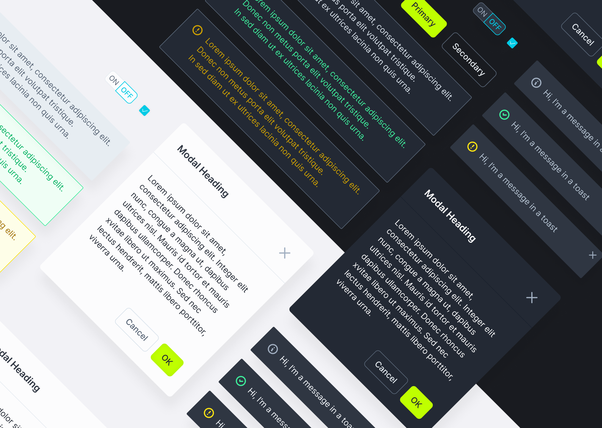
Over the past several years, I have been the primary contributor and maintainer of Sesimi's UI library, meticulously crafting, maintaining, and extending components in both React and Figma. Currently, I am migrating documentation and components from the now-deprecated DocZ to our new Storybook setup.